 01/03/2023
  Steve Bearden
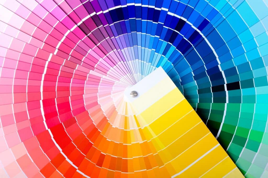
Are you tired of submitting your designs to the printer only to be disappointed by the final color results? You’re not alone! Even professional graphic designers struggle with achieving color accuracy due to the many variables involved.
But fear not! We’ve compiled a list of simple, yet effective tips to help you improve the consistency of your colors and get the results you want. From converting to CMYK and finding out your printer’s color profile, to improving your workspace and using professional software, these tips will have you well on your way to color perfection.
So if you’re ready to elevate your design work and achieve truly accurate colors, read on!
Why Color Accuracy Matters
Color accuracy is important in commercial printing because it ensures that the printed materials accurately represent the intended colors and design. Inaccurate colors can lead to a poor visual experience for the viewer and can also affect the overall effectiveness and professionalism of the printed materials.
For example, if a business is printing marketing materials such as brochures or flyers, the colors need to be accurate in order to effectively convey the brand and message. If the colors are off, it can distract from the content and give the impression that the business is not professional or attention to detail.
Achieving Color Consistency
Accurate color is essential for professional graphic designers and print companies. However, achieving color consistency can be challenging due to a range of variables. Here are some tips for improving color accuracy in your design work:
Convert your art file to CMYK color mode. Many graphic designers work in RGB mode, but this can result in unpredictable color substitutions when printing. To convert to CMYK, go to “Image” then “Mode” and select “CMYK” in Adobe Photoshop. Other Adobe software allows you to work in different color modes with color profiles attached.
Improve your workspace. Working in dark or overly bright conditions can affect color perception, and glare on your monitor can also cause issues. Make sure you view your images at a straight angle, and consider using a quality monitor like a Dell ultra-quality 4k or Samsung U28E590DS. Calibration tools like the Spyder5ELITE can also be helpful for serious print designers, but may not be necessary when submitting art to commercial printers.
Use professional software. Programs like Microsoft Word are not optimal for color-conscious professionals. Instead, use software specifically designed for graphic design, such as Adobe Photoshop or Illustrator.
Test different media. Different papers may produce different results, so it may be necessary to test a range of options to achieve the colors you desire.
By following these tips, you can improve the accuracy of your colors and achieve the results you want when printing. Remember, color consistency is an art form that requires fresh thinking and testing, so don’t be afraid to experiment and try new techniques.
Achieving color accuracy is essential for professional graphic designers and print companies. By ensuring accuracyyou can improve the consistency of your colors and achieve the results you want.
We’re here to help you get the best possible results for your print projects. To learn more about achieving perfect color accuracy every time, reach out to the Linemark team today!


