

 05/31/2026
  Steve Bearden
A retail-ready book is less a creative masterpiece and more a feat of precise industrial engineering. You’ve likely spent months perfecting your manuscript, yet the transition from a digital screen to a physical object often brings a sense of technical anxiety. It’s natural to worry about text disappearing into the binding or images losing their vibrancy because of an incorrect color profile. Understanding how to prepare a file for book printing is the critical bridge between a digital draft and a product that rivals the quality of major publishing houses.
We’re here to provide the technical clarity you need to move forward with confidence. This guide masters the specifications required for a flawless first run, ensuring you avoid costly pre-press correction fees. We’ll examine the latest 2026 standards for Adobe InDesign 21.4 and the unified Affinity suite, covering everything from 300 DPI resolution requirements to the specific gutter margins needed for high-volume custom book printing. By the end of this article, you’ll have a streamlined workflow for producing professional, retail-grade results every time.
Key Takeaways
- Understand why professional layout software is essential for creating files that industrial presses can process without manual intervention.
- Discover how to prepare a file for book printing using precise trim, bleed, and safety zone specifications to ensure a clean, professional finish.
- Implement CMYK color management and 300 DPI resolution standards to achieve vibrant, sharp results on the physical page.
- Master the PDF/X-1a export process to embed fonts and lock in your layout for a consistent, high-volume print run.
- Learn to navigate the pre-press proofing phase to catch color shifts and technical errors before your project reaches the production floor.
The Fundamentals of Print-Ready File Preparation
In the professional sphere, “print-ready” is a specific technical status. It means your document contains every piece of metadata, font embedding, and color profile necessary for a high-speed press to run without manual correction. This is the primary goal when learning how to prepare a file for book printing. Unlike a digital draft meant for screen viewing, a print-ready file serves as a fixed instruction set for heavy machinery. It eliminates ambiguity, ensuring that what you see on your calibrated monitor is exactly what appears on the finished page.
Before the ink hits the paper, your file enters the prepress process. This is the critical quality control phase where technical specialists verify that your digital assets align with physical manufacturing capabilities. It’s a strategic checkpoint that ensures your vision translates accurately to the final product. Skipping this technical rigor often results in “chopped off” text or images that look dull and washed out.
To visualize how these preparations impact the physical binding and production of a book, watch this brief overview:
Why Industrial Printing Requires Specific Standards
Commercial presses operate at speeds and pressures that a home office printer cannot replicate. A standard DOCX file is designed for dynamic screen viewing and low-resolution desktop output. It doesn’t lock elements in place; this leads to shifted text and missing images on a commercial line. When you invest in custom book printing, you’re utilizing industrial-grade technology that demands precise data. If errors like low-resolution images or missing bleeds aren’t caught until the press is running, the waste and downtime can lead to significant cost implications for the project.
The Essential Software Toolkit for Book Design
Professional results require professional tools. Adobe InDesign 21.4 remains the industry standard because it offers the most granular control over typography and color management. For those seeking an alternative, the unified Affinity suite, which reached version 3.2.1.4425 in May 2026, provides a robust, cloud-integrated workflow that handles complex layouts effectively. While tools like Canva or Microsoft Word are useful for short documents, they lack the sophisticated export engines required for high-page-count book projects. Using non-specialized tools often results in muddy colors or layout shifts that fail to meet retail standards.
Mastering Layout Specifications: Trim, Bleed, and Safety Zones
Precision is the hallmark of industrial production. When you are determining how to prepare a file for book printing, you must move beyond creative aesthetics and focus on mechanical tolerances. The trim size is your starting point. It defines the final physical dimensions of your book after the excess paper has been cut away. If your trim size is 6 inches by 9 inches, your digital canvas must match these dimensions exactly. Any discrepancy here can lead to scaling issues that distort your typography and imagery.
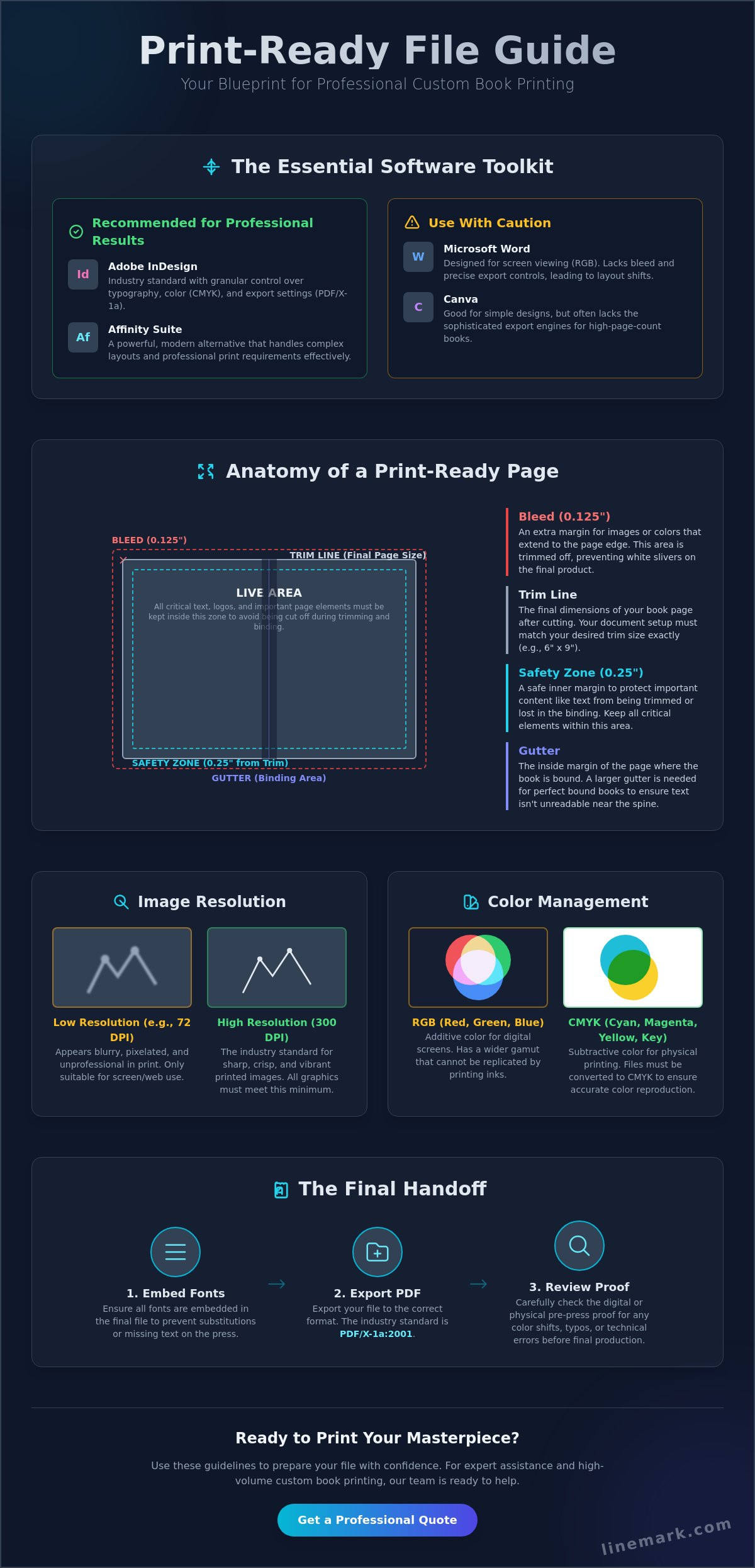
To ensure your images reach the very edge of the page, you must include a bleed. Standard industrial requirements dictate a bleed of 0.125 inches on all sides. This extra margin acts as a buffer for the high-speed cutting blades used in the finishing process. Without it, even a microscopic shift in the blade could result in a thin, white sliver at the page edge. Technical guides from UW-Madison Printing Services confirm that failing to account for bleed is a primary reason for file rejection. While the bleed extends outward, the safety zone protects content inward. We recommend keeping all critical text at least 0.25 inches away from the trim line to prevent content from being partially cut off during binding.
Calculating the Gutter for Different Binding Types
The gutter is the margin adjustment that prevents text from disappearing into the fold of the book. Perfect bound books require a larger inner margin because the spine glue consumes more space than a simple fold. For books between 150 and 400 pages, a 1.0-inch gutter is standard. Once you exceed 400 pages, you should increase this to 1.25 inches. In saddle-stitched booklets, you must also account for creep. This is where inner pages are pushed outward by the thickness of the paper, requiring a gradual adjustment of the outer margins to keep the layout centered.
Setting Up Your Workspace for Success
Efficiency begins in the document setup window. In Adobe InDesign, always select Facing Pages to visualize how your spreads will look once bound. This allows you to manage gutters and margins as mirrored pairs rather than isolated sheets. Utilize Master Pages to lock in consistent headers, footers, and page numbering across the entire manuscript. This centralized control ensures that your custom book printing project maintains a uniform, professional appearance. Modern designers also benefit from creating non-printing layers for technical guides. By placing your safety zones and trim lines on a locked top layer, you can verify your layout’s alignment in real-time without these lines appearing in the final PDF export.
Optimizing Graphics and Color for Industrial Presses
Achieving industrial-grade clarity requires a fundamental shift in how you perceive color and resolution. Screens display light in RGB, but physical presses layer ink in CMYK. This transition is where many projects falter. When you master how to prepare a file for book printing, you ensure that the deep blues or vibrant reds on your monitor don’t turn into a muddy disappointment on the substrate. For coated paper, utilizing a standard color profile like FOGRA39 helps maintain consistency across different high-capacity production lines.
Every raster image must meet the non-negotiable 300 DPI standard at its final print size. Beyond resolution, you must monitor Total Ink Coverage (TIC). Industrial standards generally require staying under a 300% ink limit. If your combined Cyan, Magenta, Yellow, and Black values exceed this, the paper becomes oversaturated. This leads to “set-off,” where ink from one page transfers to the back of another during the binding process. Using vector graphics for logos and typography is the best way to avoid these issues, as they remain crystal-clear regardless of scaling.
The Secret to Professional Blacks
Not all blacks are created equal on a high-speed press. Plain black (100% K) is essential for body text because it uses only one printing plate. This prevents “ghosting” or blurry edges if the press plates shift slightly during a high-volume run. However, plain black can look like dark charcoal in large background areas. For these sections, we use “Rich Black,” a formula such as 60C 40M 40Y 100K. This mixture creates a deep, velvet-like saturation that gives your book a premium, high-end feel without exceeding ink limits.
Image Quality and Scaling Pitfalls
Scaling pitfalls often derail a project in the final stages. “Upsampling” a low-resolution image in your software doesn’t actually improve quality; it merely stretches existing pixels, resulting in a soft or “crunchy” appearance. Always verify your images at 100% of their final print size. If an image looks soft on your screen at that size, it won’t pass a professional pre-press inspection. Additionally, be wary of how your software handles transparency and drop shadows. While the modern PDF/X-4 standard allows for live transparency, older PDF/X-1a exports will flatten these elements. This can sometimes cause “stitching,” where thin white lines appear around transparent objects in the final print. Checking your digital proofs for these artifacts ensures your project remains in capable hands from start to finish.
Typography and Exporting the Final Print-Ready PDF
The export phase is where your digital design becomes a manufacturing blueprint. When you are refining how to prepare a file for book printing, you must treat the PDF as a locked instruction set. One of the most common technical failures is font substitution. If your fonts aren’t properly embedded, the printing system might default to generic typefaces like Courier. This destroys your layout’s integrity. Using the PDF/X-1a standard is the most reliable way to ensure all elements, including complex typography, remain exactly as you intended for high-volume production.
Before you generate the final file, utilize your software’s pre-flight panel. This tool acts as an automated technical audit. It scans your entire manuscript for missing links, overset text, and low-resolution images that you might have missed during the design phase. Catching these errors now prevents costly delays once the project reaches the production floor. It’s also vital to separate your project into two distinct files: one for the interior pages and one for the cover. This allows the press to handle different paper stocks and binding requirements for each component simultaneously.
The 5-Step Export Checklist for InDesign
Generating a reliable file requires specific settings within the Adobe InDesign export window. Follow this sequence to maintain professional standards:
- Select the PDF/X-1a:2001 or High Quality Print preset to ensure maximum compatibility with industrial RIP (Raster Image Processor) systems.
- Navigate to the Marks and Bleeds tab and check Use Document Bleed Settings to include the necessary 0.125-inch margins.
- Export the interior manuscript as Pages so the press can sequence them correctly for binding.
- Export the cover file as Spreads to keep the back cover, spine, and front cover as a single, continuous layout.
- Verify that Optimize for Fast Web View is unchecked, as this setting is designed for digital browsers and can cause data loss during high-resolution printing.
Calculating Spine Width for the Cover File
The physical thickness of your book is determined by the paper stock’s PPI (Pages Per Inch). You can find the correct dimensions using a simple formula: (Page Count / PPI) = Spine Width. Paper weight dramatically alters this calculation; a 60# offset stock creates a much thinner spine than an 80# gloss coated stock. If your spine width is incorrect, your cover art will shift, causing titles to wrap onto the front or back panels. To ensure your layout is perfect, we recommend using our custom book printing resources to verify your spine dimensions based on your chosen paper stock before you finalize the export.
Navigating the Pre-Press Phase with a Professional Partner
Once you have mastered the technical nuances of how to prepare a file for book printing, your project moves from the digital desktop to the production floor. This transition is a collaborative journey where your technical preparation meets industrial expertise. The pre-press phase is your final opportunity to verify every detail before the high-speed presses begin their run. While digital proofs are excellent for checking layout and text placement, physical press proofs remain the gold standard. They allow you to see exactly how the ink interacts with your specific paper stock, providing a level of color accuracy that a backlit monitor cannot replicate.
Reviewing a proof requires a disciplined eye. You aren’t just looking for typos; you are verifying trim marks, bleed alignment, and potential color shifts. This is the “Final Approval” milestone. Once you sign off, the project enters the manufacturing cycle. For organizations managing multiple titles or complex marketing collateral, integrating this process with marcom on-demand solutions allows for streamlined, long-term inventory management. This transforms book production from a one-off transaction into a scalable strategic asset that responds to market needs in real time.
Common Pre-Press ‘Red Flags’ to Avoid
Even with rigorous preparation, certain technical artifacts can compromise the final product. Watch for “hairline” rules. These are lines thinner than 0.25 points that may not register clearly on a high-resolution plate, leading to broken or invisible borders. Another risk is “overprint” errors. This occurs when the software is set to print one color directly on top of another rather than knocking it out; this often causes text to disappear into dark background colors. Finally, perform a last check for orphans and widows. These stray lines of text at the beginning or end of a page can undermine the professional aesthetic of an otherwise perfect layout.
Scalable Solutions for High-Volume Success
Reliability at scale is what separates industrial manufacturing from simple print-on-demand services. Linemark operates a 90,000-square-foot facility designed to handle complex book manufacturing with meticulous precision. Our infrastructure supports a unified approach to communications, where you can easily combine your book project with targeted direct mail campaigns to reach your audience effectively. This holistic journey ensures your project is handled by seasoned experts who value both efficiency and high-touch service. Ready to transform your manuscript into a retail-ready reality? Contact Linemark today for a custom book printing quote.
Transforming Your Manuscript into a Retail-Ready Reality
Achieving a professional finish requires more than creative vision; it demands technical precision. By mastering bleed requirements, gutter margins, and CMYK color profiles, you ensure your work translates perfectly from the screen to the press. Understanding how to prepare a file for book printing is the most effective way to eliminate technical errors and avoid costly production delays. This technical rigor secures your place in a competitive market where manufacturing quality is the ultimate differentiator. It’s the bridge between a digital draft and a retail-grade product that readers will value.
We combine our 30+ years of industrial printing expertise with a 90,000-square-foot high-capacity production facility to handle your most ambitious projects with meticulous detail. As a G7 Master Qualified Printer, we maintain the highest standards of color consistency and operational excellence across every run. Our team acts as a strategic ally, ensuring your project moves seamlessly from pre-press to final binding with absolute reliability. Request a Professional Book Printing Consultation today to discuss your specific project goals. Your masterpiece is in capable, steady hands.
Frequently Asked Questions
What is the difference between a bleed and a margin in book printing?
Bleed is the area extending 0.125 inches beyond the final trim size where images and background colors must reach to prevent white edges after cutting. Margins are the internal spaces between the trim line and your content. While the bleed protects the external edge, margins ensure your text remains aesthetically centered and safe from the physical page boundary.
Can I submit my book file as a Microsoft Word document?
What resolution should my images be for a professional book?
All raster images must have a resolution of at least 300 DPI at their final physical print size. Web graphics at 72 DPI will appear blurry or pixelated when processed by high-capacity digital or offset presses. Using 300 DPI ensures that every detail in your photography or illustrations remains sharp and professional on the finished substrate.
How do I calculate the spine width for my book cover?
Spine width is calculated by dividing your total page count by the Pages Per Inch (PPI) of your chosen paper stock. For example, a 200-page book on 400 PPI paper results in a 0.5-inch spine. Because paper thickness varies significantly between 60# offset and 80# gloss coated stocks, you should always verify the PPI with your printing partner before finalizing your cover spread.
What is a PDF/X-1a file and why do printers prefer it?
PDF/X-1a is an industry-standard format that flattens transparency and forces all colors into the CMYK or spot color space. This format is preferred because it eliminates technical variables that cause errors during the RIP (Raster Image Processor) phase. It provides a stable, “locked” version of your document that ensures your fonts, images, and layout remain exactly as you designed them.
Why do the colors on my screen look different than the printed book?
Screens display colors using light in the RGB spectrum, while industrial presses use CMYK ink. This fundamental difference in color space, coupled with the fact that monitors are backlit, means that printed colors often appear slightly more muted than their digital counterparts. Utilizing a calibrated monitor and a standard profile like FOGRA39 helps bridge this gap for more accurate results.
What is the ‘safety zone’ in a book layout?
The safety zone, or live area, is the region at least 0.25 inches inside the trim line where all critical text and graphics should reside. This internal buffer accounts for the mechanical tolerances of high-speed trimming blades. Keeping your content within this zone ensures that page numbers, headers, and body text aren’t accidentally cut off or lost in the binding fold.
Should I provide my cover and interior as one file or two?
You must provide two distinct files to ensure a successful production run. The interior should be a single PDF containing all pages in sequential order. The cover must be a separate file designed as a unified spread, including the back cover, the calculated spine, and the front cover. This allows the press to handle the different paper stocks and binding requirements for each component efficiently.