 06/26/2026
  Steve Bearden
Your choice of paper is a high-stakes logistical asset that defines your brand’s bottom line, especially with hardwood pulp prices approaching $1,300 per ton. It’s frustrating to see a meticulously designed direct mail piece arrive damaged or watch your vibrant brand colors turn dull on a stock that wasn’t built for the job. You’ve likely felt the sting of overpaying for premium weight only to find it didn’t actually move the needle on your conversion rates. Mastering the art of choosing paper for commercial printing is about finding the precise intersection of aesthetic excellence and fiscal responsibility.
This guide provides a clear framework to help you match technical specifications to your specific project goals. You’ll learn how to navigate the 2026 regulatory environment, including Extended Producer Responsibility laws in states like Maryland and Washington, while optimizing stock weights to slash your mailing costs. We’ll break down the nuances of brightness, opacity, and finish so your next project delivers the high-impact results your brand deserves. We’re moving beyond simple transactions to help you build a more resilient, tech-forward print strategy that scales with your growth.
Key Takeaways
- Master the relationship between basis weight and GSM to eliminate show-through and ensure your high-volume books maintain structural integrity.
- Navigate the functional differences between coated stocks for superior ink holdout and uncoated textures that offer a premium, organic feel.
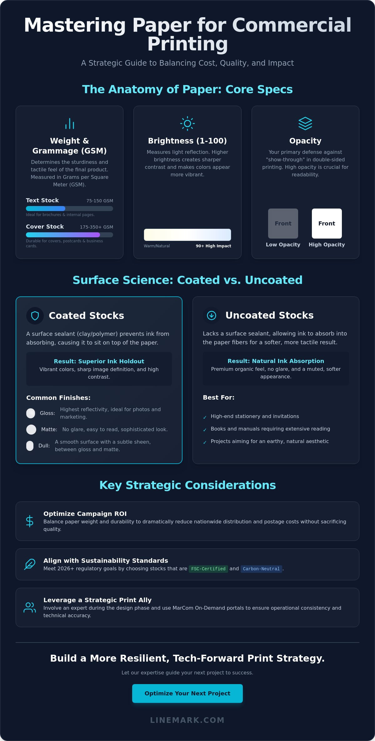
- Optimize your campaign ROI by choosing paper for commercial printing that balances durability with weight to reduce nationwide distribution and postage costs.
- Align your production with 2026 sustainability standards by selecting FSC-certified and carbon-neutral stocks that don’t sacrifice visual impact.
- Learn why involving a strategic print ally during the design phase and using MarCom On-Demand portals ensures operational consistency across your organization.
The Core Technical Specs: Weight, Brightness, and Opacity
Success in any high-volume project begins with understanding the fundamental paper properties that dictate both performance and perception. Technical specifications aren’t merely numbers on a spec sheet; they’re the variables that determine whether your ink sits crisply on the surface or bleeds through to the other side. When you’re choosing paper for commercial printing, you have to look past the surface level to ensure the stock can handle the mechanical stresses of high-speed presses and automated finishing equipment.
To better understand how different finishes and weights impact the final visual result, watch this overview of common paper types:
Demystifying Paper Weight and Grammage
Commercial paper is categorized into two primary families: Text and Cover. Text stocks are lighter and flexible, ideal for the interior pages of brochures and catalogs. Cover stocks are thicker and more rigid, providing the durability needed for postcards and annual report covers. The weight you choose impacts everything from folding precision to binding longevity. Grams per Square Meter (GSM) is the global standard for industrial paper measurement.
Brightness vs. Whiteness: Visual Performance
Brightness is measured on a scale of 1 to 100, representing the light reflected off the paper. High brightness levels (90+) create a sharp contrast that makes colors pop, which is essential for image-heavy marketing collateral. Whiteness refers to the shade of the paper. A “blue-white” stock feels modern and cool, while “cream-white” offers a warmer, traditional aesthetic that’s easier to read. Many premium stocks use Optical Brightening Agents (OBAs) to achieve high-contrast results.
Opacity and Caliper: The Hidden Essentials
Opacity measures how much light passes through a sheet, serving as your primary defense against “show-through” in double-sided printing. For high-volume books, high opacity is non-negotiable to keep the text on the reverse side from distracting the reader. Caliper, or the actual thickness of the sheet measured in points, dictates the tactile feel. A high-caliper sheet feels substantial and authoritative, even if it has a lower basis weight. Balancing these specs ensures your project feels premium without adding unnecessary bulk to your distribution logistics.
Coated vs. Uncoated: Navigating Ink Absorption and Texture
Choosing paper for commercial printing requires a strategic understanding of how ink interacts with the substrate’s surface. Coated stocks feature a surface layer of clay or polymer that creates “ink holdout,” a phenomenon where the ink sits on top of the paper rather than being absorbed into the fibers. The result is vibrant, high-contrast imagery that commands immediate attention. In contrast, uncoated stocks lack this sealant, allowing ink to penetrate the “tooth” of the paper for a softer, more organic feel. Selecting the right paper stock for commercial printing depends entirely on your project’s visual goals and the specific lighting conditions of the end-user’s environment.
A critical distinction often overlooked by less experienced providers is how digital vs. offset presses interact with these surfaces. Digital toners bond to the surface of coated sheets differently than liquid offset inks. Some coatings are specifically engineered for digital production to prevent cracking along folds or delamination. If you’re running a hybrid campaign that utilizes both methods, our team helps you select a stock that maintains visual consistency across every piece. Our commercial printing expertise ensures that your technical choices align with your production technology for a seamless result.
The Coated Spectrum: Gloss, Matte, and Dull
Gloss finishes provide the highest level of reflectivity. They’re the standard for high-impact large format graphics and retail signage where color saturation is the primary priority. However, gloss can cause significant glare under harsh fluorescent office lighting, making long-form text difficult to read. Matte and dull coatings offer a sophisticated middle ground. They provide the smoothness of a coated sheet without the distracting shine. For high-volume direct mail, adding a UV coating or aqueous finish provides an extra layer of durability that ensures your piece survives the rigors of the postal system without scuffing.
The Uncoated Aesthetic for Specialized Communications
Uncoated stocks offer a tactile experience that suggests authenticity and personalized attention. Non-profits and associations frequently utilize uncoated paper for direct appeals because it feels more like a personal letter than a mass-produced advertisement. The challenge with uncoated stock is managing ink absorption. Because the surface is porous, “dot gain” can occur, where ink droplets expand and potentially muddy fine details. Utilizing premium textures like linen, laid, or felt can differentiate your brand, but these require careful press adjustments to maintain clarity. Our precision-driven process ensures that even on the most porous surfaces, your brand imagery remains sharp and professional.
Matching Paper Stocks to High-Volume Commercial Applications
The “Golden Rule” of paper selection is simple: begin with the end-user’s physical interaction with the piece. When you’re choosing paper for commercial printing at scale, you aren’t just buying a substrate; you’re engineering an experience. A catalog that feels flimsy in a customer’s hands suggests a flimsy product, while a heavy, rigid stock for a 500-page technical manual makes it impossible to use in the field. Balancing durability with portability is a logistical necessity for nationwide distribution, where every ounce of weight translates into significant freight and postage costs.
Variable Data Printing (VDP) introduces another layer of complexity. High-speed digital production requires stocks that can handle rapid heat cycles and ink absorption without curling or jamming. If your direct mail strategy relies on personalized messaging for every recipient, the paper must be compatible with the specific digital technology used to avoid “tracking” or toner flaking. This technical alignment ensures that your high-volume runs maintain consistency from the first sheet to the thousandth.
Selecting Paper for Custom Book Printing
In high-volume manufacturing, the relationship between paper weight and “bulk” is critical for the final binding process. Perfect bound books require a specific flexibility in the interior pages so the spine doesn’t crack when opened, while case bound books often demand a higher-opacity stock to maintain a premium feel. The “bulk” of the paper, or its thickness per page, directly dictates the width of the spine. This affects shelf presence and the layout of the cover wrap. For a deeper dive into these technical specs, our guide to custom book printing provides detailed binding requirements.
Optimizing Direct Mail for Engagement and ROI
Postage is often the largest expense in a print campaign. Choosing the right stock for postcards involves meeting strict USPS thickness requirements, typically 7pt or 9pt, to ensure they survive automated sorting equipment. However, the psychology of weight shouldn’t be ignored. High-end donor solicitations often perform better on heavier, textured stocks that signal importance and urgency. For durable self-mailers and catalogs, we recommend specialized substrates that resist tearing during transit, ensuring your message arrives in pristine condition. This strategic alignment between paper choice and distribution goals is what transforms a simple print job into a high-ROI marketing asset.
Logistical and Environmental Factors in Paper Selection
Logistics dictate the actual return on investment for any high-volume campaign. While previous sections focused on the visual and tactile aspects of choosing paper for commercial printing, the backend of the process is where budgets are won or lost. Beyond the price per sheet, you must account for how paper behaves during finishing and distribution. For instance, grain direction is a critical technical factor often overlooked in the design phase. If your project involves intricate folds, the paper must be folded with the grain to prevent the fibers from breaking and creating unsightly cracking along the edges. This attention to mechanical detail ensures your final product maintains its structural integrity throughout the mailing process.
Modern production standards in 2026 have also dismantled the old myth that eco-friendly paper is inherently more expensive or lower in quality. Advanced manufacturing techniques now allow carbon-neutral and recycled stocks to match the brightness and ink holdout of virgin fiber sheets. We help you navigate these choices to ensure your environmental commitments enhance your brand without compromising the professional finish of your collateral. If you’re ready to optimize your next high-volume run for both sustainability and cost, contact our logistics team to review your project specifications.
Sustainability: FSC Certification and Recycled Stocks
Environmental responsibility is now a baseline requirement for corporate communications. Understanding the difference between post-consumer waste (PCW) and pre-consumer recycled content is essential for accurate reporting. PCW comes from materials that have been used by consumers and recycled, while pre-consumer content consists of mill scraps that never reached the end-user. Utilizing FSC-certified stocks ensures that the wood fiber used in your paper comes from responsibly managed forests. Many organizations now use printed “bug” logos on their brochures and annual reports to clearly communicate this commitment to their stakeholders.
Balancing Weight with Mailing and Distribution Costs
Postage is frequently the most significant expense in a direct mail campaign, making paper weight a primary logistical lever. There is often a “break point” in postal regulations where a slight increase in paper thickness or weight pushes a piece into a higher cost tier, potentially adding thousands of dollars to a nationwide distribution. High-bulk, low-weight stocks are an innovative solution to this challenge; they provide the thickness and “stiffness” of a heavier sheet while maintaining a lower physical weight. Switching from 100lb text to 80lb text for a 100,000-piece mailer reduces the total paper weight by approximately 1,250 pounds, a difference that often triggers a significant shift in postage classification. By strategically selecting these substrates, you can maintain a premium feel while protecting your campaign’s bottom line.
The Strategic Partnership: Leveraging Industrial Expertise
Early collaboration is the primary catalyst for operational excellence. Choosing paper for commercial printing shouldn’t be an afterthought relegated to the final stages of a creative project. Linemark’s 30 plus years of experience proves that the most successful high-volume campaigns are those where the printer and designer work in tandem from the initial concept. This collaborative approach prevents technical failures, such as selecting a stock that cannot withstand specific binding requirements or high-speed digital heat cycles. We act as a strategic communications ally, ensuring your vision is technically viable and logistically sound.
For national organizations, maintaining brand consistency across decentralized teams is a significant logistical challenge. Utilizing marcom on-demand portals allows your organization to standardize paper choices and templates across the entire enterprise. This centralized destination ensures that every brochure, catalog, or newsletter maintains the same tactile quality and brand integrity, regardless of where it’s ordered or distributed. It’s a scalable solution that mirrors the precision of a boutique shop at an industrial scale.
Prototyping and Proofing Your Selection
Digital proofs are excellent for verifying layout and copy, but they’re fundamentally deceptive regarding the physical reality of ink on paper. A screen cannot represent how ink will sit on a porous uncoated stock or how a matte coating will diffuse light. We recommend requesting “drawdowns” for critical brand color matching. These physical samples show exactly how your specific brand colors interact with your chosen substrate. Additionally, “blank dummies” are essential for assessing the weight, spine width, and “hand” of a finished book before you commit to a full production run.
Scaling Production with Confidence
High-volume manufacturing requires a robust supply chain and meticulous inventory management. We ensure paper availability for multi-phased production runs, protecting your project from the market fluctuations mentioned earlier in this guide. Our integrated services connect your paper selection directly to our kitting & fulfillment workflows. This unified journey from design to distribution eliminates friction and guarantees that your materials are produced, stored, and shipped with absolute precision. Our goal is to provide a steady, controlled environment where your complex projects are handled with expert care.
Contact Linemark today for a custom quote and paper consultation.
Optimizing Your 2026 Print Strategy
Success in modern production requires a shift from viewing paper as a simple canvas to treating it as a high-performance logistical asset. We’ve explored how technical specifications like GSM and opacity prevent show-through in high-volume books, while the choice between coated and uncoated stocks dictates the precision of your ink holdout. Choosing paper for commercial printing is a strategic decision that balances brand impact with environmental responsibility and distribution ROI. By aligning these variables during the design phase, you protect your bottom line from unexpected postage tiers and production delays.
Linemark brings 30 plus years of industrial printing expertise and a 90,000-square-foot high-capacity facility to every project. Our nationwide distribution and fulfillment capabilities ensure that your materials are handled with meticulous attention to detail at every stage of the journey. We’re ready to act as your strategic communications ally, providing the technical insight needed to scale your operations with confidence. Request a Strategic Print Consultation and Paper Samples today to experience the precision of a unified partnership. Let’s build a print strategy that drives measurable growth and lasting impact for your organization.
Frequently Asked Questions
What is the best paper weight for a professional brochure?
80lb or 100lb text weight is the industry standard for professional brochures. These weights provide enough substance to feel premium without becoming too bulky for folding. If your project requires a more authoritative presence, we recommend a 100lb cover for the outer wrap combined with 80lb text for the interior pages. This combination ensures durability and a high-end tactile experience for the recipient.
Is there a difference between coated and uncoated paper for digital printing?
Yes, digital toners bond to the surface of coated sheets differently than liquid offset inks. When choosing paper for commercial printing using digital technology, it’s vital to select stocks specifically engineered for digital presses. These papers are treated to handle high heat and ensure the toner doesn’t flake or crack, especially along fold lines. Using the wrong stock can result in poor image adhesion and a compromised final product.
How does paper opacity affect my printing costs?
Paper opacity directly impacts costs by determining whether you can use a lighter weight stock for double-sided projects. If a paper has low opacity, you’ll see show-through from the reverse side, often forcing a move to a heavier, more expensive sheet to maintain legibility. By selecting a high-opacity, low-weight substrate, you can reduce the total weight of your mailer or catalog, potentially saving thousands of dollars in nationwide postage expenses.
Can I use recycled paper for high-quality photography books?
Modern premium recycled stocks are fully capable of supporting high-quality photography books. Advanced manufacturing processes in 2026 have produced recycled papers that match the brightness and ink holdout of virgin fiber. To ensure the best results, we recommend a coated recycled stock with high brightness levels. This provides the necessary contrast for vibrant imagery while meeting your organization’s environmental sustainability goals without sacrificing the professional aesthetic.
What is the minimum paper thickness required for USPS postcards?
The USPS requires a minimum thickness of 0.007 inches, commonly referred to as 7 point stock, for all postcards. If your postcard exceeds 4.25 by 6 inches, it must meet a higher 9 point thickness standard to survive automated sorting equipment. Selecting a stock that falls below these requirements can result in your mail being rejected or damaged during transit, which negatively impacts your total campaign ROI and brand perception.
What is the difference between text weight and cover weight paper?
Text weight paper is a lighter, more flexible substrate typically used for the interior pages of brochures, catalogs, and newsletters. Cover weight is a thicker, more rigid stock designed for postcards, business cards, and the outer wraps of books. Understanding this distinction is fundamental when choosing paper for commercial printing because it dictates the structural integrity of your piece. Using the correct weight ensures your collateral functions as intended in the end-user’s hands.
Why is grain direction important for my printed project?
Grain direction is the orientation of the wood fibers in the paper, and it’s critical for achieving clean, professional folds. Folding against the grain causes the fibers to break, resulting in unsightly cracking and a jagged edge. For any project involving intricate folding or binding, we ensure the grain runs parallel to the fold line. This technical precision maintains the structural strength of the piece and prevents damage during high-speed automated finishing.
How do I choose the right paper finish to reduce glare?
Selecting a matte, dull, or silk finish is the most effective way to reduce glare under harsh lighting. While gloss finishes offer high reflectivity and vibrant color, they can make long-form text difficult to read in office environments. Matte and dull coatings provide the smoothness and ink holdout of a coated sheet without the distracting shine. This choice improves legibility for annual reports and technical catalogs while maintaining a sophisticated, high-end appearance.


