

 10/13/2026
  Steve Bearden
What if a trade show table cover works harder when it says less? If you’re figuring out how to design a trade show table cover, it’s tempting to fit in every product detail, logo, and message. But a crowded design is harder to read from across an aisle, and key artwork can disappear around the table’s edges or beneath the tabletop.
A polished cover starts with how people will see and use your booth. It should help visitors recognize your brand quickly, give them a clear reason to engage, and feel consistent with the rest of your display. That means deciding what to feature, where to place it, and how the design will translate from a screen to a printed surface.
This guide walks through visual hierarchy, table dimensions, viewing angles, and artwork preparation. It also explains how to coordinate a cover with backdrops, signage, and conference displays. With a little planning, you can create a design that reads clearly from different approaches and supports the goals of your booth.
Key Takeaways
- Start with your event goal, audience, and key message to decide what the cover should communicate.
- Learn how to design a trade show table cover that supports booth visibility without crowding the brand message.
- Match the layout to visitor sightlines, including whether attendees will approach from the front or multiple directions.
- Use the selected cover’s production template to account for dimensions, seams, and safe areas before finalizing artwork.
- Coordinate approved logos, colors, and copy with backdrops and conference displays for a consistent event environment.
How a Trade Show Table Cover Supports Your Booth Design
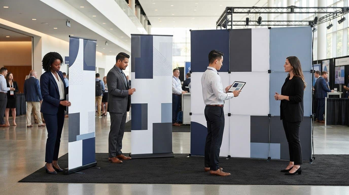
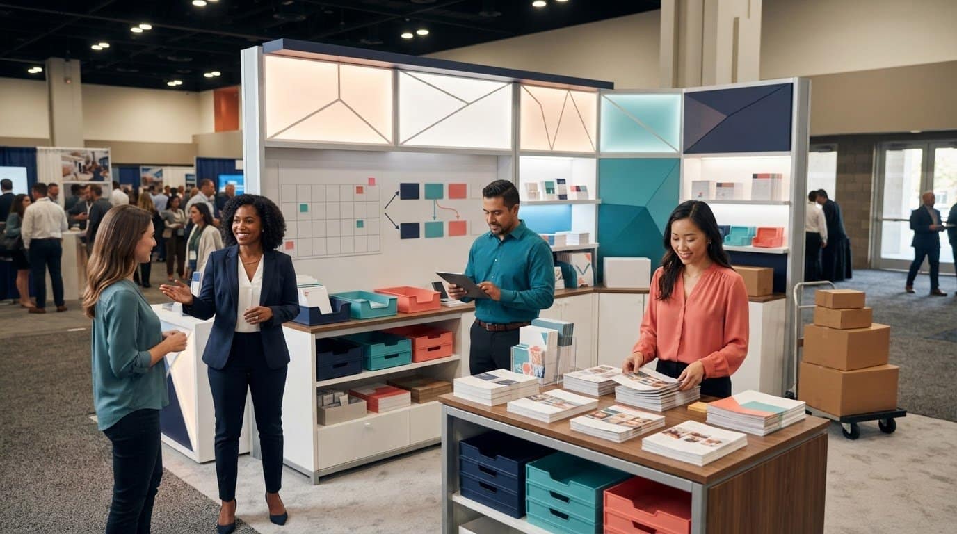
A trade show table cover turns the front and sides of a booth table into part of the event’s visual communication. A backdrop frames the booth from behind; a cover puts your identity and message at table level, where visitors see it as they approach or speak with your team. Used thoughtfully, it can identify your organization, reinforce a campaign, and connect the table visually to the rest of the display.
The cover should communicate quickly from the aisle, then support conversation up close. Someone passing by needs to recognize the organization or core offer at a glance. A visitor who stops should be able to connect that first impression with the discussion. A clear design gives the table a deliberate role in the booth instead of leaving it as an incidental surface. For context on how booth design and promotional materials work within an event, see this Trade show overview and components.
For a visual example of table covers as part of a trade show display, watch:
Start with the event goal and audience
Before choosing graphics or copy, define what the table should help you accomplish. For brand recognition, make the organization’s name and logo prominent. For product awareness, lead with the featured offer. Lead generation or event information may call for a simple prompt that makes the next step clear. Decide who you want to reach and what action should feel easy, such as starting a conversation or asking about a solution.
Keep the cover’s central message consistent with the wider event campaign. If the backdrop introduces a service, the table can reinforce that theme instead of competing with it through unrelated copy. Try this test: can a passerby identify the organization and main idea without stopping, while someone at the table can read any supporting details?
Design for the booth, not just the tabletop
Assess the table in context with the booth layout, backdrop, lighting, and nearby displays. Consider how attendees enter the space and where they are likely to pause. If the main approach is from the aisle, prioritize the surface visible from that direction. If visitors can approach from several sides, plan for those sightlines too. Keep essential text away from areas that could be obscured by the table setup, materials, or staff activity.
Then compare the cover’s colors, logo, and message with the other event graphics. Consistency doesn’t mean repeating every element everywhere; it means making each piece feel connected through a considered visual system. Linemark’s large-format graphics guide offers context for planning coordinated visuals, including backdrops and conference displays. Considering the full environment helps the cover support the booth’s message rather than compete for attention.
- From the aisle: Make the organization or primary message easy to recognize.
- At the table: Keep supporting information clear and useful during conversation.
- Across the booth: Align the cover’s visual choices with the surrounding display.
How to Design a Trade Show Table Cover Step by Step
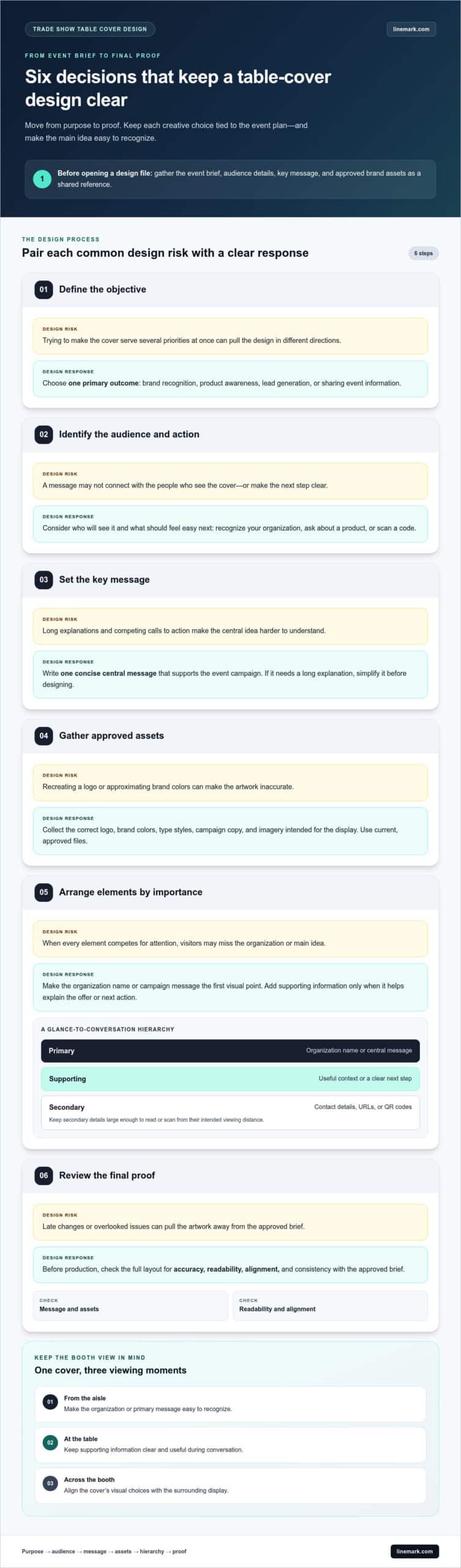
A reliable design process moves from purpose to proof, keeping creative choices tied to the event plan and the finished display. Before opening a design file, gather the event brief, audience details, key message, and approved brand assets. This gives everyone working on the artwork a shared reference and helps prevent late changes that pull the design in different directions.
The Trade show marketing and booth design strategies resource from the American Marketing Association offers broader context for aligning booth messaging with event goals. Apply the same discipline to the cover:
- Define the objective. Decide whether the priority is brand recognition, product awareness, lead generation, or sharing event information. Choose one primary outcome to guide the design.
- Identify the audience and action. Consider who will see the cover and what you want them to do next, such as recognize your organization, ask about a product, or scan a code.
- Set the key message. Write one concise central message that supports the event campaign. If it needs a long explanation to make sense, simplify it before designing.
- Gather approved assets. Collect the correct logo, brand colors, type styles, campaign copy, and imagery intended for the display. Use current, approved files rather than recreating logos or approximating colors.
- Arrange elements by importance. Make the organization name or campaign message the first visual point. Add supporting information only when it helps explain the offer or makes the next action clear.
- Review the final proof. Check the full layout for accuracy, readability, alignment, and consistency with the approved brief before it moves into production.
Build a clear visual hierarchy
Visual hierarchy guides the eye from the most important element to supporting details. That order helps attendees recognize your brand or message quickly, even as they pass the booth. Give the primary message the strongest position, then add a secondary line only if it provides useful context or a clear next step. Contact details, URLs, and QR codes should stay secondary and be large enough to read or scan from their intended viewing distance. Avoid stacking competing calls to action; one clear prompt is easier to understand and act on.
Use color, typography, and imagery consistently
Use approved brand colors and type styles so the cover fits with the rest of your event materials. Strong contrast between text and background helps preserve legibility under changing venue lighting, while a limited set of type styles keeps the message organized. Choose sharp, relevant imagery only when it strengthens the story. Decorative graphics that add no meaning can distract from the message and make the layout feel crowded.
Before approval, step back from the screen and assess the design at a glance, then inspect the details. Confirm that the copy is accurate, the logo is clear, and supporting elements don’t compete with the primary message. For a coordinated event environment, Linemark’s large-format graphics and event displays provide a useful reference as you plan related booth visuals.
Which Table-Cover Layout and Design Choices Fit Your Booth?
The right layout depends on what the cover needs to do and how people move through the booth. Full-coverage branding can create a bold, unified presence, while a restrained design may suit a focused message or a display that already has prominent graphics. Neither approach is automatically better. Consider the viewing angles, available visual space, and whether the cover should attract attention from the aisle or support conversations at the table.
Use this comparison to narrow your options. Then assess the layout against your actual booth environment.
Layout choice
Visibility
Content density
Coordination
Full coverage
Can create a continuous branded presence across visible panels.
Works best when graphics and copy have a clear order, not when every area carries a separate message.
Coordinate colors and imagery with the booth so the cover feels like part of one display.
Restrained layout
Directs attention to a logo or key message, especially in a visually busy booth.
Leaves more open space and can make a single offer easier to notice.
Can balance a backdrop or banner with stronger graphics, without adding competing detail.
Front-focused design
Prioritizes the main aisle-facing view.
Concentrates key information on the front panel.
Pairs well with a layout where the backdrop carries broader campaign imagery.
Multi-approach design
Extends identity to side panels for people approaching from different directions.
Needs clear prioritization so repeated or supporting elements remain easy to scan.
Repeats selected brand cues across panels and related event graphics.
Choose what appears on the front, sides, and top
Give the most visible front-facing area the principal identity or message. Side panels can carry secondary branding when attendees can see them, such as at an open-corner booth or along a walkway. If the sides face a wall or neighboring display, extra copy there may add little value. Treat the tabletop as a working surface: brochures, product samples, and staff activity can cover graphics, so keep essential information away from spots likely to be obstructed.
For a front-only approach, concentrate the design on the aisle-facing panel. If visitors can approach from multiple directions, decide how the side panels contribute without making each one feel like a separate advertisement. This is a practical decision in how to design a trade show table cover: map likely approaches first, then assign content to the surfaces people can actually see.
Match the design to the event environment
Consider booth size, neighboring displays, traffic direction, and viewing distance. A compact booth beside bold graphics may benefit from a simpler cover, while a more open layout may give visitors time to notice a fuller visual treatment. Coordinate the cover’s colors, logo, and imagery with backdrops, banners, and conference displays. Linemark’s MarCom On-Demand guide provides context for maintaining consistent brand assets across distributed marketing materials, an approach that can also help keep event graphics aligned.
How to Prepare and Review Table-Cover Artwork Before Printing
A strong layout can still disappoint if the file doesn’t match the finished format. Before setting final dimensions, obtain the production template for the specific cover you’ve selected. Templates, safe areas, seams, and finished dimensions vary by product, so don’t rely on measurements from another cover or a generic table diagram. Use the template as the working guide for placing artwork where it will appear as intended.
Artwork preparation is a key part of how to design a trade show table cover. It connects the approved design to the physical layout and reduces the risk of misplaced content or unexpected scaling. Keep the event brief and final copy nearby while preparing the file, so production details don’t distract from checking that the design still communicates the intended message.
Set up the file using the supplied template
Build the artwork to the template’s stated dimensions and follow its instructions for bleed, safe areas, seams, and folds. Keep logos, headlines, contact information, and other critical content inside designated safe zones. Background color or imagery may extend farther if the template calls for it, but don’t place essential details where they could be trimmed, wrapped, or obscured.
Use vector artwork for logos and text where available, since vector graphics can scale without becoming pixelated. Photos and other raster images need enough resolution for their final printed size; a common large-format guideline is 100-150 dpi at full size. Set color mode and export the file according to the printer’s current file guide, rather than relying on settings from an older project. If a requirement isn’t clear in the template, resolve it before final export.
Proof the design at realistic viewing conditions
Review the complete artwork at full scale when practical, or use a scaled proof that’s clearly labeled with its scale. A design viewed only at high zoom on a monitor can hide readability problems. Check headlines and contact details at a realistic viewing distance, and confirm that important text doesn’t cross a seam, fold, or panel boundary.
Then inspect the whole file, not just the most prominent graphic. Look for unexpected color shifts, distorted logo proportions, awkward image crops, alignment issues, spelling errors, and outdated contact information. Compare the proof with the approved copy and brand assets. If the file changes after review, generate a revised proof so approval applies to the exact artwork moving forward.
Final preflight: confirm template dimensions, safe-area placement, seam clearance, image resolution, vector logos, color settings, export requirements, contrast, alignment, spelling, logo proportions, image crops, and contact details before approving the proof.
For event graphics that need coordinated production planning, explore Linemark’s large-format graphics alongside your artwork preparation.
Moving from Table Covers to Cohesive Event Displays
A table cover is one part of the event environment, not a standalone design exercise. Before approving it, review how its message, colors, and imagery work alongside the backdrop, banners, and conference displays. The goal isn’t to repeat the same artwork everywhere. Instead, create a recognizable system in which each piece has a distinct role and the full booth feels connected.
Use the final design review to compare the assets together, ideally in a shared layout or event mockup. Check that the table cover doesn’t introduce a competing headline, that key campaign elements remain consistent, and that each graphic is legible in its intended position. Reviewing the graphics together can reveal inconsistencies that aren’t obvious when files are viewed separately.
Create a consistent event graphics system
Carry approved brand colors, typography, and message hierarchy across related materials, then adapt them to each format. A backdrop can establish the campaign or set the visual scene; a table cover can reinforce the identity at the point of conversation. Don’t simply stretch one layout to fit every surface. Reposition or resize elements to suit each graphic’s dimensions and viewing conditions, then check that the assets communicate one coherent identity when displayed together.
Prepare a clean production handoff
Bring approved logos, color references, final copy, linked assets, and artwork files together. Name files clearly, distinguish drafts from approved versions, and identify exactly which artwork is cleared for production. This simple version control reduces ambiguity when multiple graphics or reviewers are involved. Keep the relevant template and proof with the handoff so the approved design can be matched to the correct specifications.
Production requirements depend on the project specifications and the selected display formats. Print method, file setup, and finishing considerations should follow those requirements rather than assumptions carried over from another job. Linemark’s large-format graphics and conference-display experience provides useful context when planning an event environment, from individual graphics through a coordinated set of materials.
Before release, use a final handoff check:
- Confirm the approved artwork version is clearly identified.
- Include the applicable templates, brand references, and linked assets.
- Verify that copy and logos are consistent across the event graphics.
- Make sure each layout is prepared for its own format, not copied over unchanged.
This organized approach brings the planning behind how to design a trade show table cover into the wider production workflow, helping teams keep creative intent and production files aligned. Explore Linemark’s large-format graphics solutions for support planning related event visuals.
Take Your Event Graphics from Plan to Production
Your next step is to bring the approved table-cover concept into the full event plan. Think beyond one surface: consider how each graphic will guide attention, support conversation, and reinforce the experience you want attendees to remember. A clear production handoff helps turn the decisions behind how to design a trade show table cover into a coordinated display system.
Linemark’s large-format capabilities include graphics, signage, pop-ups and backdrops, and conference displays. With more than 30 years of industry experience and end-to-end printing, finishing, and fulfillment capabilities, Linemark can support planning for event materials as a connected production project. The focus is on aligning artwork, specifications, and intended use across the display.
Ready to plan your event visuals? Explore Linemark’s large-format graphics solutions and bring related event materials together in a clear, coordinated plan.
Frequently Asked Questions
How do I choose the right design for a trade show table cover?
Start with the event objective and the people you want to reach. To decide how to design a trade show table cover, write down the one idea attendees should remember, then choose a logo or campaign identity that makes it recognizable. For example, a product launch may need the product name to lead, while a networking event may prioritize the organization. Map where visitors will enter and pause before placing key content, then check the layout against the production template and proof.
What should I put on a trade show table cover?
Lead with an organization name, logo, or event-specific campaign message that visitors can identify quickly. Add a short supporting line only if it explains what you offer or clarifies the event message. A contact detail or QR code can provide a next step, but consider whether visitors can use it comfortably in the booth setting. For instance, a short label beside a QR code can explain whether it opens a product page, event schedule, or sign-up form.
Can I use a QR code on a trade show table cover?
Yes, if it serves a clear purpose and visitors can find and scan it easily. Link it to a useful destination, such as a focused product page or event resource, and add a brief label that tells people what they’ll find there. Preserve the code’s quiet area, and avoid placing it near a seam, fold, or spot likely to be blocked by materials on the table. Test the destination and scan the artwork from a realistic distance before approval.
How do I make a table-cover design readable from across a booth?
Keep the main message short, make it the most prominent element, and create strong contrast between the type and its background. A passerby should be able to recognize the organization or campaign without stopping. Avoid paragraphs, fine print, and small contact details in areas meant for long-distance viewing. Check the cover in a booth mockup or alongside the surrounding graphics, since competing headlines or similar colors nearby can make even clear text harder to notice.
Should a trade show table cover match the rest of my booth graphics?
Yes, it should feel connected to the booth’s visual system while still being composed for its own shape and viewing angles. Carry approved colors, typography, logo treatment, and campaign language across the cover and backdrop. Then adjust image crops and information placement for each format. For example, a backdrop might carry a broad campaign visual while the table cover uses a concise identifier. Consistency comes from shared cues, not from duplicating the same layout on every surface.
How can I check a table-cover design before sending it to print?
Use the selected cover’s production template to check dimensions, safe areas, folds, and seams, then inspect the proof for details that can be missed on screen. Confirm spelling, contact information, logo proportions, image crops, contrast, and alignment. Open the exported file to ensure fonts and linked assets appear as expected. If reviewers approve separate drafts, clearly identify the final version and have the person responsible for the event and brand approve that exact file.