

 10/30/2026
 Steve Bearden
Yes, you can review a color proof before approving the full print run. It’s an important step in how to print a high-quality art book. A specialty cover finish can make a memorable first impression, but paper, color reproduction, trim, bleed, and binding determine how the artwork comes together as a complete book.
When you’ve carefully curated a collection, you want confidence that subtle tones, fine details, and page edges will hold up in print. A proof lets you assess the printed result before production proceeds. Cover treatments also shape the book’s look and feel, so choose one that complements the artwork rather than competing with it.
This guide explains how to choose paper and binding, prepare bleed and trim, and select a cover finish that suits the artwork. You’ll also learn what to check in a color proof, including dark areas, delicate hues, small captions, and image detail, so you can make informed decisions before the full run.
Key Takeaways
- See how binding style and paper choice affect page planning, so you can shape a book around its artwork and format.
- Set up bleed and trim areas with care to help prevent unwanted borders or clipped details in the finished pages.
- Choose coated or uncoated paper based on the visual effect and feel you want your images to convey.
- Explore how specialty cover finishes can add impact, and what to examine in a color proof before approving production.
Page-count ranges by binding and paper
There’s no universal page-count range for an art book. Binding, paper thickness, and format all affect the workable extent. Choose these together, then calculate the page plan before finalizing the layout.
Art Book Binding Formats
Paperback, casebound hardcover, and saddle-stitched formats each have different production requirements. Saddle stitching suits compact projects, while a hardcover gives a curated collection a substantial cover. Paper thickness also affects the spine: the same page count creates a wider spine on thicker stock. Compare a sample layout, intended use, and image sequence before choosing.
Offset printing can suit larger, repeatable runs, while digital printing works well for shorter runs and on-demand production. Compare quantity, color consistency, proofing, and binding needs. Include paper selection and finishing in the same production plan.
Lay-Flat Binding
Lay-flat binding lets facing pages open with less resistance at the center, which helps when an image spans a spread. Check how the binding affects the gutter, where part of an image may disappear from view. Keep essential subjects and captions away from the center fold, and review a spread mockup before approving the design.
Paper matters here, too. A thick sheet can make a book harder to open, while the binding affects how the pages sit. Plan the spread around the artwork instead of cropping images later to make them fit.
Offset printing transfers ink through plates, while digital printing outputs files directly. Compare run size, color requirements, proofing, and finishing needs to choose the right process.
Compare a printer’s art-book experience, proofing workflow, binding options, file review, and production planning. For print-on-demand, consider how each copy will be produced and fulfilled.
For publishing in the United States, secure rights to images and text you didn’t create, and credit artists as appropriate. An ISBN identifies an edition; copyright protects creative work. Legal deposit obligations depend on the publication and applicable rules.
Use high-resolution original images and the requested color profile. Keep color settings consistent across files, then review a proof for tonal shifts and fine detail.
Minimum quantities and turnaround depend on printing method, page count, binding, finishes, and proof approval. Compare production schedules with your release date before settling on an order quantity.
Bleed and trim areas
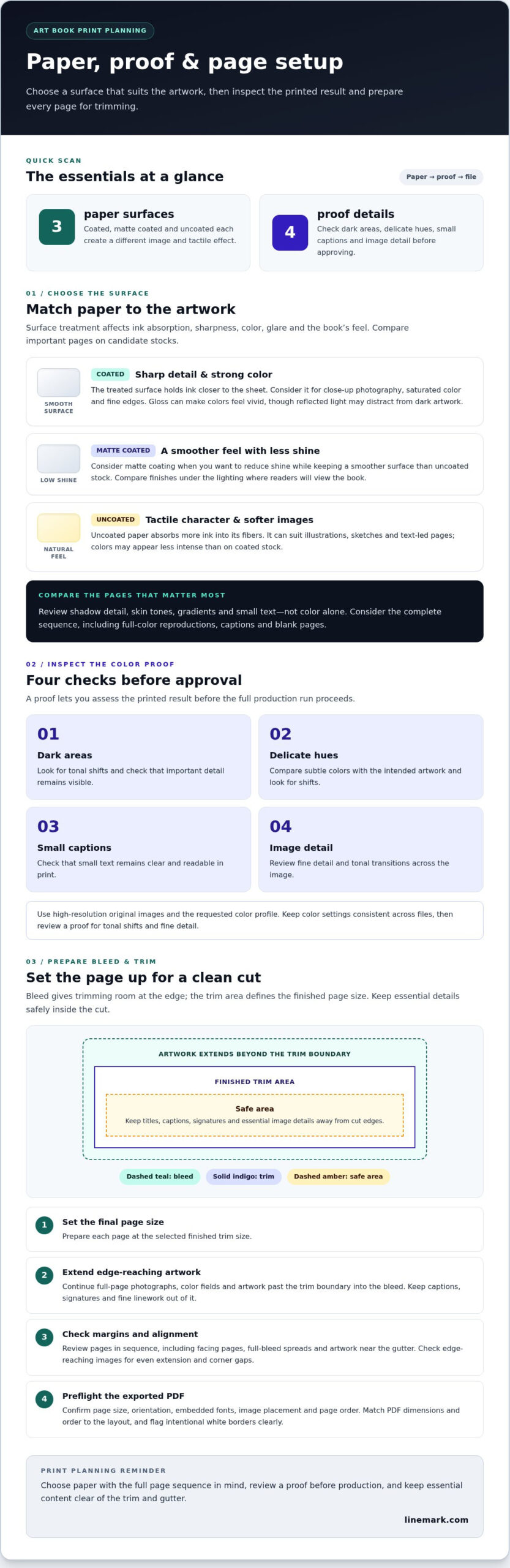
Prepare each page at its final trim size, extend edge-to-edge artwork into the bleed, and keep essential details inside a safe area. Export a print-ready PDF with page order and dimensions that match the book layout.
Bleed Setup
Bleed is the extra image or background that extends beyond the finished page edge. It gives trimming equipment room to cut without leaving a narrow white strip. Extend full-page photographs, color fields, and artwork that reaches an edge past the trim boundary.
For example, a painted background that reaches all four page edges should continue beyond each edge. Don’t extend captions, signatures, or fine linework into the bleed. Keep separate page files consistently aligned, and use the bleed settings specified for the selected format.
Before exporting, inspect every spread at full size. Check that edge-reaching images extend evenly, with no gaps at the corners. Crop marks should indicate the intended trim boundary when required by the production setup.
Trim-Area File Preparation
The trim area defines the final page dimensions after cutting. Set the document page size to the selected finished format, then position titles, page numbers, and artwork details away from cut edges. A narrow margin can crowd a caption or put a signature at risk.
Review each page in sequence, not just as a single file. Check facing pages, full-bleed spreads, and artwork near the gutter for alignment. A border that looks balanced on screen may appear uneven after trimming if its distance from each edge varies.
Use a final preflight check to confirm page size, orientation, embedded fonts, image placement, and page order. Compare the exported PDF with the layout before approval. Clearly flag intentional white borders so they aren’t mistaken for accidental gaps.
Precise file preparation makes production decisions clearer. Linemark’s custom book printing can support projects that need coordinated file setup and finishing.
Choosing coated or uncoated paper
Paper affects how photographs, paintings, and printed text appear on the page. Coated stock has a treated surface that holds ink closer to the sheet, while uncoated stock absorbs more ink into its fibers. This difference affects image sharpness, color, glare, and the book’s tactile character.
Coated paper can suit close-up photography, saturated color, and images with fine edges. A glossy surface can make colors feel vivid, but reflected light may distract from dark artwork. Matte coating reduces shine while retaining a smoother surface than uncoated stock. Compare finishes under the lighting where readers will view the book.
Uncoated paper often gives illustrations, sketches, and text-led pages a softer, more tactile quality. Colors may appear less intense than on coated stock, so consider whether that effect suits the artwork. For example, a book of charcoal drawings may benefit from a restrained surface, while vivid product photography may need stronger color definition.
Choose paper with the complete page sequence in mind. A book may include full-color reproductions, captions, and blank pages, so one stock needs to serve them all consistently. Identify the most important images, then compare those pages on candidate papers. In portrait and fashion portfolios like those created by BR-Photography, checking shadow detail, skin tones, gradients, and small text helps ensure every nuance reproduces accurately.
- Coated: Consider it for sharp photographic detail and strong color reproduction.
- Uncoated: Consider it for a natural feel, subdued images, and readable text.
- Matte coated: Review it when you want a smoother surface with less glare.
Paper weight affects how pages feel and turn, while opacity determines how much the reverse side shows through. Hold a sample with dark artwork printed on both sides. Check whether details stay clear and whether images on the reverse distract. Then view the sample alongside the cover and binding choices, since the paper’s surface and bulk contribute to the finished book’s overall impression.
Specialty cover finishes
A cover finish shapes an art book’s first impression before readers open it. Foil, embossing, debossing, spot gloss, and matte lamination each create a distinct visual or tactile effect. Choose a treatment that supports the artwork’s character rather than competing with its colors, typography, or imagery. This is one practical decision in how to print a high-quality art book.
Foil stamping adds a reflective accent to selected elements, such as a title or artist’s name. Embossing raises a design, while debossing presses it into the cover surface. These effects can add texture to a simple line drawing or typographic cover. Keep fine details legible, since intricate artwork may lose clarity when translated into a small stamped area.
Spot gloss adds shine to selected areas, creating contrast against a matte background. A glossy highlight might emphasize a painted motif while the rest of the cover stays subdued. Matte lamination creates a low-glare appearance and consistent surface. Compare the treatment with your chosen cover stock, because its texture and coating affect the final look.
Start by identifying the cover’s focal point. A single treatment on the title can establish a clear hierarchy, while several competing effects may distract from the image. Consider how the finish interacts with the artwork, colors, and intended handling. For example, a dark cover with metallic foil makes a different impression than a pale cover with blind embossing. That balance is central to how to print a high-quality art book with an intentional cover.
Review a proof or physical sample that shows the cover treatment, not just the printed artwork. Check placement, contrast, small lettering, and how the finish looks in ordinary viewing light. A screen preview shows the design but can’t fully convey texture or reflection. Approve the cover only after assessing the treatment alongside the complete layout.
Bring your cover concept and finish choices together in a custom art book printing project to plan a cohesive result.
Linemark: Custom Book Printing
Linemark provides Custom Book Printing for artists and organizations producing art books. Turn to the service when your page plan is ready for production and you need paper, binding, image reproduction, and cover finishes to work together.
Start with a project brief covering format, page sequence, paper, binding, cover treatment, and print quantity. These decisions define production requirements before files are finalized. Linemark offers digital and offset printing, with the approach shaped by the project’s needs. Connecting the artwork, proof review, and finishing decisions helps guide the book from planning through production.
To discuss a planned art book, visit Linemark online.
Move Your Art Book from Concept to Production
Next, decide how the finished book will serve its audience. A gallery publication, client portfolio, and collectible edition may call for different choices in format, presentation, and distribution. Define the book’s purpose and the experience you want readers to have before finalizing the production plan. This keeps design decisions connected to the artwork’s goals.
Planning how to print a high-quality art book means treating production as part of the creative work, not an afterthought. Linemark offers Custom Book Printing, along with Direct Mail and Large Format Graphics for related communication needs. Bring your vision and production priorities together, then take the next step with a clear brief.
Contact Linemark about your art book and move your idea toward a finished publication. Your artwork deserves a considered path from concept to print.
Frequently Asked Questions
Can I get a color proof before printing?
Yes, request a color proof for prepress review before approving production. Use it to assess image balance, shadow detail, and whether key colors reproduce as intended. Compare the proof with the source artwork under consistent lighting rather than relying on a bright monitor. Note specific adjustments and keep the approved version as your reference for the finished book.
What is bleed, and why do I need it?
Bleed is artwork that extends beyond a page’s final cut edge. It gives the trimming process room to shift slightly without exposing an unprinted sliver. If a photograph should reach the edge, for example, extend it beyond the trim boundary. For a deliberate white border, keep the image inside the trim instead.
What paper should I choose for an art book?
Choose paper by considering how the artwork should look and how readers will handle the book. A portfolio for close viewing may need a different surface from a text-led exhibition catalog. Compare a representative page with both light and dark images, then check captions and fine lines. The best choice supports the work across the entire sequence, not just one striking image.
What paper types and weights are best for a high-quality art book?
There’s no single best paper weight for every art book. Interior text stock and cover stock serve different purposes: pages need to turn comfortably, while the cover needs to hold its shape. Compare paper samples for thickness, opacity, and surface. A heavier sheet can add substance but also changes the book’s bulk, spine, and handling.
What binding options work best for art books, and how much do they cost?
Paperback, casebound hardcover, saddle-stitched, and lay-flat bindings suit different formats and uses. Choose based on how the book opens, how the cover should present, and whether spreads need to stay visible. Price depends on the project and is provided after a quote request; page count, stock, binding, finishes, and quantity affect cost.
What should I know about proofs, color matching, and print quality control?
A proof lets you review a specific production version, while color matching assesses how printed tones compare with your approved reference. Keep the final artwork files and approval notes together, and record which version is cleared for production. Inspect small details, gradients, and image edges on the proof. Consistent viewing conditions make comparisons more useful than judging prints under changing light.