

 10/28/2026
 Steve Bearden
A puff ink design succeeds before the ink reaches the press. Bold shapes and clear space between raised elements give the expanding ink room to form a soft, dimensional texture. Fine details can disappear when the surface itself becomes part of the design.
That’s why specialty inks and finishes for print require more than a striking color choice. The artwork must suit the material effect, printing method, and level of detail you want to preserve.
This guide explains how metallic inks differ from foil stamping, what reflective, glow-in-the-dark, fluorescent, and neon effects do, and how coatings add contrast or texture. You’ll also learn what makes artwork work well with puff and other specialty screen-printing techniques, so you can plan an effect that carries through from file to finished print.
Key Takeaways
- Choose metallic ink for color and shine, or foil stamping when a more reflective finish is central to the design.
- Match reflective, glow-in-the-dark, fluorescent, and neon effects to the way the printed piece will be seen and used.
- Build specialty effects into the artwork plan, using clear shapes and intentional contrast to help the finish stand out.
- Consider how ink, coating, paper, and print method work together before finalizing a design for production.
Metallic inks
Metallic inks suspend fine aluminum or bronze pigment particles in standard ink to add color and shine. They look different from foil stamping, which is generally more reflective. Ink forms part of the printed image; foil is a separate finish. Durability depends on the ink, substrate, and handling, while cost depends on setup and materials. Metallic toner can also create a gold or silver effect without traditional foil dies and lengthy setup, making it an option for short runs.
Paper stock and print method shape the result. Metallic inks are compatible with offset printing, while pearlescent pigments suit screen or flexographic printing because of their particle size. Mica-based pearlescent pigments may be coated with titanium dioxide or iron oxide to create a metallic sheen. Glitter inks use less reflective particles for sparkle, so avoid extremely small details in glitter and metallic areas. Iridescent ink needs another color beneath it, with black producing the strongest effect.
There’s no single price for common U.S. print jobs: cost depends on the process, ink coverage, stock, quantity, and setup. Pricing is provided after a quote request. Metallic ink overprinted with other colors requires two passes: print the metallic ink first, then let it dry completely. The extra pass and drying step can affect turnaround. Metallic toner may suit short runs by avoiding traditional foil dies and lengthy setup. Minimum quantities depend on the process and production setup.
Available effects include metallic, matte, glossy, pearlescent, and holographic foil, as well as embossing, debossing, and spot UV. Foil stamping transfers foil with heat and pressure and can be combined with embossing or debossing. For interactive artwork, reserve foil for a headline or emblem, then use a raised impression to add dimension. Specialty inks and finishes for print also require attention to intended use: address compliance requirements before printing products for children, food-adjacent products, or regulated promotional mechanics. Consider ink and coating materials alongside the paper or other substrate.
Foil stamping
Foil stamping transfers a layer of foil onto a printed surface using heat and pressure. The technique adds a distinct metallic or specialty finish without relying on metallic ink.
Foil Applications Across Print Items
Foil can highlight a name on a business card, details on an invitation, or a logo on packaging. On labels, it can draw attention to a product mark; on awards, it can emphasize a title or emblem. These applications work best when foil has a clear role in the layout. A focused area creates contrast and tactile interest without competing with surrounding text.
Holographic Foil
Holographic foil has a reflective, shifting appearance that changes with the viewing angle and light. It can bring movement to packaging, invitations, or award graphics, while metallic, matte, glossy, and pearlescent foils create other surface effects. When extending dynamic optical effects to large-format displays or immersive visual installations, specialized studios like Softmotion achieve motion through lenticular printing. Choose a finish to suit the design’s purpose: a holographic accent can make one mark stand out, while broad coverage changes the impression of the whole piece.
Foil screen printing uses a different sequence from traditional stamping: an adhesive coating is printed on the substrate, then foil adheres to those areas. This creates a chrome-like image. Because the adhesive layer is part of the design, its placement and shape determine where the reflective effect appears. It’s a useful technique for graphics that call for defined foil areas.
Plan foil alongside other finishes. Embossing raises an image, while debossing presses it into the stock; either can be combined with foil to add texture and a tactile change. Spot UV, by contrast, applies a clear polymer coating to designated areas and cures it with ultraviolet light. Scratch-off ink is different: it places an opaque, removable layer over a reveal graphic. Separate these effects in the artwork so each retains its intended role.
Reflective, glow-in-the-dark, fluorescent, and neon inks
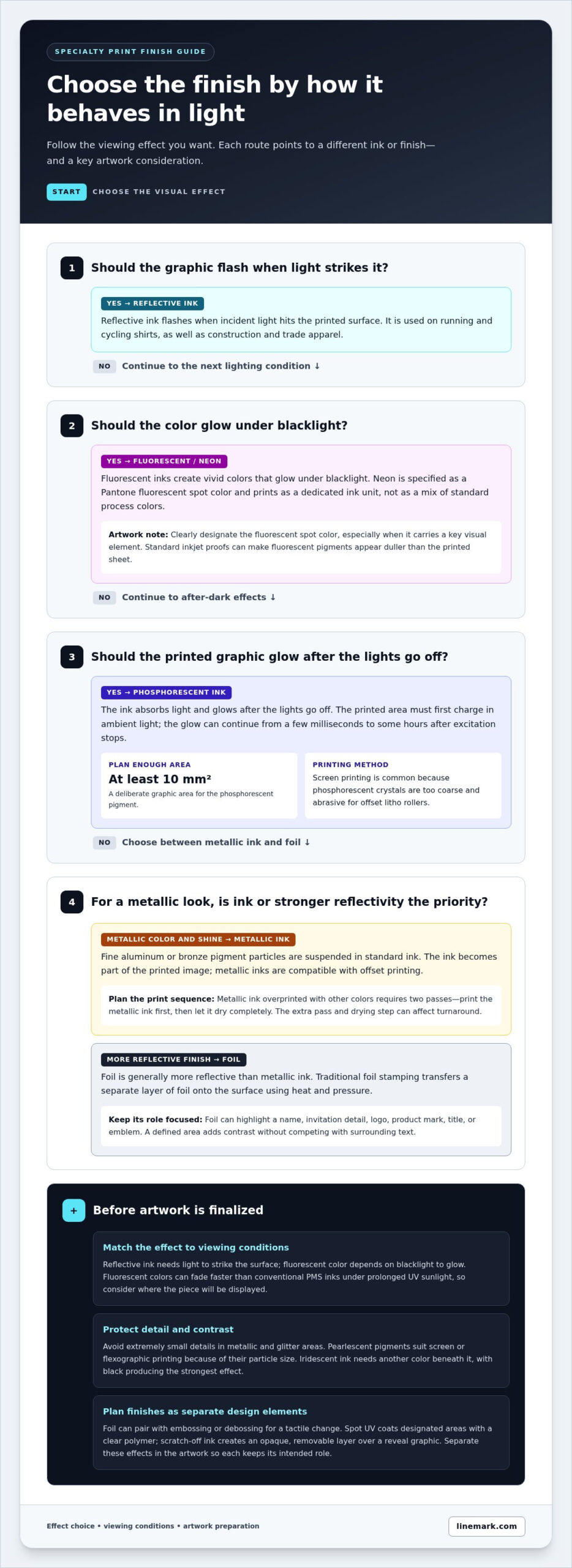
Specialty ink options include metallic, fluorescent, reflective, phosphorescent, and white toner effects. Each changes how a graphic responds to color, light, or darkness, so choose according to where and when the printed piece will be viewed.
Fluorescent and Neon Inks
Fluorescent inks create vivid colors that glow under blacklight, while neon inks are specified as Pantone fluorescent spot colors. Neon prints as a dedicated ink unit rather than relying on standard process colors to imitate it. This distinction matters when preparing artwork: clearly designate the fluorescent spot color, especially when it carries a key visual element. Standard inkjet proofs can make fluorescent pigments appear duller than the printed sheet.
Fluorescent colors can fade faster than conventional PMS inks under prolonged exposure to UV sunlight. For a poster displayed indoors, that may matter less than for graphics exposed to sustained sunlight. Consider viewing conditions alongside color impact and durability.
Reflective Ink Effects
Reflective ink flashes when light strikes it, unlike fluorescent color, which glows under blacklight. Screen-printed reflective graphics are used on running and cycling shirts, as well as construction and trade apparel. They can support visibility when a light source hits the printed surface, while fluorescent colors emphasize vivid appearance under suitable lighting.
Plan the graphic around the intended lighting. A reflective mark needs incident light to create its flash; a fluorescent element depends on blacklight to glow. These effects serve distinct visual roles, so make each easy to read rather than layering them indiscriminately.
Glow-in-the-Dark Inks
Phosphorescent ink absorbs light and glows after the lights go off. Printed items must first charge in ambient light, and the glow can continue from a few milliseconds to some hours after excitation stops. Screen printing is common because phosphorescent crystals are too coarse and abrasive for offset litho rollers.
For a satisfying effect, plan a glow area of at least 10 mm². This gives the phosphorescent pigment enough printed area to register as a deliberate graphic, rather than a tiny, easily missed detail. White toner is another specialty option: it lays down a white base before colored toners on dark materials, helping colors remain visually distinct.
Artwork preparation for specialty printing
Plan the specialty effect as part of the artwork, not as a last-minute decorative layer. A headline, image detail, or repeating pattern can receive a coating, but the chosen area must work with the design’s scale and contrast. For screen printing, vector artwork is recommended whenever possible because defined shapes clearly indicate the intended print areas.
Raised effects need room. Puff ink expands during curing, while high-density ink creates more controlled height and sharper edges. Use bold shapes for both techniques, and leave enough negative space between raised elements. A tightly packed graphic can lose clarity when texture changes the surface. Review the artwork at its intended size, especially where fine lines meet raised details.
For fluorescent ink, specify the spot color in the artwork rather than expecting a standard inkjet proof to show its full brightness. Fluorescent pigments can look duller on the proof than on the printed sheet. On dark materials, white toner provides a base layer before colored toner, helping the colors read clearly. Keep the base layer separate from the colored elements in the file.
Coating placement also shapes contrast. Spot UV applies a clear polymer coating to selected areas and works well on matte or uncoated paper, where glossy and non-glossy areas are visibly distinct. Another option pairs dull varnish on selected details with a flood application of gloss aqueous or UV coating. This lets a headline stand apart from the surrounding field without adding color.
Before finalizing promotional artwork, consider how ink texture, coating, and detail interact on the chosen material. An opaque reveal graphic beneath scratch-off ink, for example, needs a distinct area for the removable layer. Build each finish as a clearly identifiable design element, then review the composition for legibility and spacing. Prepare artwork for commercial printing with these production effects in mind.
Linemark: Custom Book Printing
Linemark provides Custom Book Printing and Commercial Printing for organizations producing books and other printed materials. If your project calls for specialty effects, consider how the finish supports the format, artwork, and intended reader experience. Clear production files and a defined finish plan help align the visual concept with the finished piece.
For campaigns beyond a bound publication, Linemark also offers Direct Mail and Large Format Graphics. These services support different communication formats, from mailed materials to large-scale displays. The right fit depends on what you’re producing and how your audience will encounter it.
To discuss a print project, contact Linemark or visit linemark.com.
Make the next print decision with purpose
Start by defining what the finished piece should make people notice, feel, or do. A metallic accent can signal distinction; a tactile surface can invite closer attention; a vivid color can help a message stand out. Let that goal guide the artwork and production choices instead of adding effects simply because they’re available. A clear brief gives the print team a practical basis for aligning the design with the format and audience.
Thoughtful planning for specialty inks and finishes for print connects creative intent with production decisions. Consider the printed piece’s role, the materials involved, and how people will encounter it. Bring those priorities into the conversation early, while the artwork can still accommodate the chosen effect.
Linemark offers Custom Book Printing, Direct Mail, and Large Format Graphics for organizations communicating across print formats. Contact Linemark about specialty printing to discuss your project and its production needs. A well-defined direction is a strong starting point for making your next printed piece more distinctive.
Frequently Asked Questions
What Makes a Good Puff Ink Design?
A good puff ink design gives the raised effect one clear focal role, such as emphasizing a simple emblem instead of body copy. Consider how the ink changes the selected color: a puff base can lighten the plastisol color and affect contrast with nearby elements. Keep supporting information visually distinct, and use the raised area to guide attention rather than carry essential fine text.
What are specialty inks and finishes in commercial printing?
Specialty inks create effects through their color, pigment, or response to light, while finishes alter the printed surface or add another material layer. A commercial piece might pair a distinct ink color with a tactile finish to set a key message apart from supporting information. Think of ink as shaping the image and the finish as shaping how the piece looks or feels.
What are the file setup and design requirements for specialty inks and finishes?
Prepare a production file that makes each special effect easy to identify and distinguish from standard artwork. Use clearly named layers or separations for elements receiving a dedicated ink or finish, and keep the underlying design organized. This helps prevent a foil, coating, or specialty color from being mistaken for ordinary printed content during production planning.
How can I choose a specialty ink or finish for business cards, packaging, or marketing materials?
Start with the job the piece must do, then match the effect to its audience and use. A business card may benefit from a tactile detail that invites handling, while packaging may need a strong visual cue on its main panel. For a marketing piece, consider viewing distance, lighting, substrate, and how often recipients will handle it before choosing an effect.
What durability, safety, and environmental considerations apply to specialty printing inks?
Durability depends on the ink, substrate, and handling; fluorescent inks can fade faster under prolonged UV sunlight. Confirm compliance requirements before printing products for children, food-adjacent products, or regulated promotions. For specialty screen-printed garments, wash inside out with cool water and mild detergent, avoid ironing directly over the design, and use low dryer heat or air dry when practical.