

 09/22/2026
  Steve Bearden
Screen displays build brilliance through emitted light, but commercial presses rely entirely on reflected ink. When an electric royal blue on your calibrated monitor transforms into a muted navy on finished collateral, you are running directly into the physical boundaries of color gamut compression. Bridging this gap starts with understanding CMYK vs RGB for print long before your files ever reach the pre-press queue. You have likely experienced the frustration of unboxing fresh marketing materials only to discover shifted, muddy brand palettes that fail to reflect your digital design work.
You don’t have to leave color fidelity to chance. By mastering the mechanical differences between additive screen models and subtractive process inks, you can ensure your digital vision translates flawlessly to physical output. Below, we outline an operational pre-flight framework covering gamut clipping, color management profiles, and the strategic deployment of rich black, spot colors, and proofing protocols across digital, offset, and large-format production.
Key Takeaways
- Grasp the physical distinction between additive emitted light and subtractive process inks to accurately predict how your layout behaves on press.
- Identify color gamut boundaries early, as understanding CMYK vs RGB for print helps you prevent clipped gamuts and unexpected hue shifts before files reach pre-press.
- Tailor color profiles and pre-flight specifications to individual collateral types, ensuring uniform brand palettes across catalogs, direct mail, and large-format graphics.
- Apply calibrated rich black formulas, total area coverage thresholds, and strategic spot colors to eliminate muddy shadows and registration defects.
- Establish calibrated soft-proofing routines within your design software to preview realistic press output while preserving high-resolution master assets.
Understanding the Core Science: CMYK vs RGB Explained
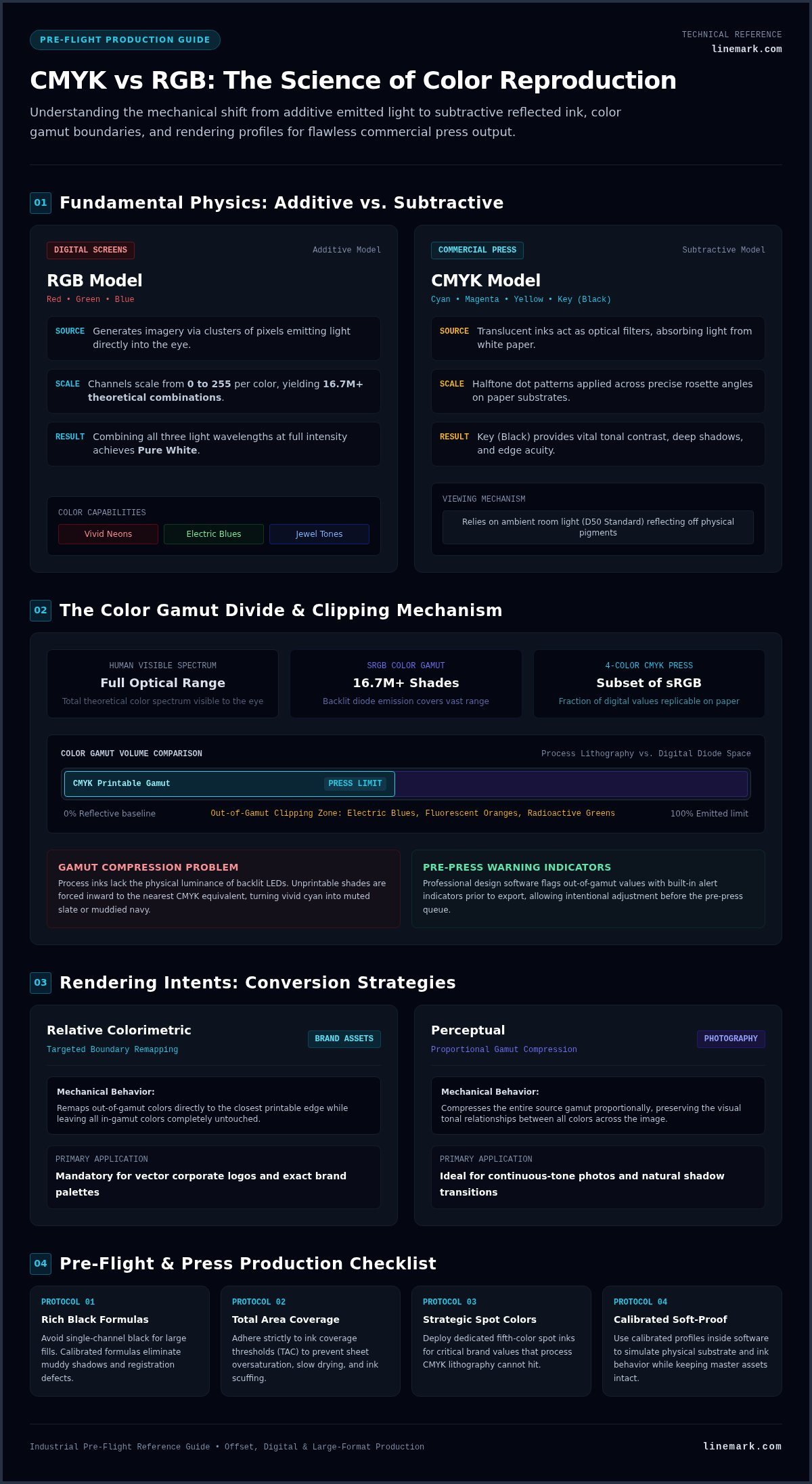
Mastering industrial reproduction begins with understanding CMYK vs RGB for print physics. At a foundational level, screen design and press production operate on opposite optical models. RGB displays light directly into the eye, whereas CMYK selectively absorbs wavelengths from reflected white light. Digital screens build brilliance by combining red, green, and blue light waves to achieve pure white. Commercial presses do the exact opposite, layering physical pigments that absorb ambient light to achieve dark tones. Every printed piece relies entirely on ambient room light reflecting off microscopic ink films and paper substrates.
To visualize how these two distinct systems handle color distribution, watch this practical breakdown of light versus pigment:
The Mechanics of RGB: Additive Color for Digital Screens
Digital monitors, mobile displays, and camera sensors generate imagery through tiny clusters of red, green, and blue pixels. Each channel uses a scale from 0 to 255 to control light intensity, producing over 16.7 million theoretical combinations. Because these devices emit powered light directly toward the viewer, they reproduce radiant jewel tones, vibrant electric blues, and vivid neons that exist strictly within the additive spectrum.
The Mechanics of CMYK: Subtractive Color for Press Inks
High-capacity commercial presses run using the CMYK subtractive color model, depositing translucent inks that act as optical filters against the paper surface. Lithographic and digital presses apply microscopic halftone dots across precise rosette angles. As ambient light hits the sheet, the ink layers absorb specific spectrums and reflect the remaining wavelengths back to your eyes. Key (black) ink provides vital tonal contrast, deep shadow values, and crisp typographic edge acuity that combining cyan, magenta, and yellow pigments alone cannot achieve.
Bridging this divide requires treating color as a physical chemistry challenge rather than a simple software toggle. A sound foundation in understanding CMYK vs RGB for print guarantees your design decisions reflect what press inks can realistically render on commercial equipment.
The Color Gamut Divide: Why Screen Colors Shift in Print
A color gamut defines the exact boundary of shades a device can accurately display or produce. The full spectrum visible to human vision dwarfs standard sRGB, yet sRGB easily encompasses millions of shades that process lithography simply cannot replicate. High-end commercial four-color press runs typically cover only a fraction of those screen values under standard D50 lighting conditions. Bridging this mechanical divide begins with understanding CMYK vs RGB for print limits, particularly when vibrant digital designs undergo gamut compression.
Visualizing Color Gamut Overlap and Out-of-Gamut Colors
Intense electric blues, radioactive greens, and brilliant fluorescent oranges consistently trigger clipping because process inks lack the luminance of backlit diodes. Design tools like Adobe Illustrator and InDesign flag these unprintable values via built-in alert indicators. When converting across color spaces, design software automatically forces out-of-gamut pixels inward toward the nearest achievable CMYK equivalent, often turning a vibrant cyan into a dull slate. Reviewing the Adobe color modes guide helps designers understand how pixel bit depths and profiles manage these transitions.
Rendering Intents: Relative Colorimetric vs Perceptual
Your conversion engine decides how to treat values that fall outside printable thresholds. Selecting the right rendering intent controls your finished visual balance:
- Relative Colorimetric: Remaps out-of-gamut colors directly to the closest printable edge while leaving in-gamut colors completely untouched. This setting is mandatory for maintaining exact vector corporate brand palettes.
- Perceptual: Compresses the entire source gamut proportionally, preserving the visual relationships between all tones. This approach is ideal for continuous-tone photography where natural shadow transitions matter more than numerical color coordinates.
Substrate Impact: How Coated vs Uncoated Paper Affects Color
Paper chemistry alters your final reproduction just as much as digital math. Coated papers feature a clay surface that provides superior ink holdout. The ink sits on top, allowing light to bounce cleanly off the pigment layer for deep contrasts and wide gamuts. Uncoated stocks, conversely, pull liquid ink deep into raw wood fibers, causing mechanical dot gain, lower solid densities, and muted midtones. Factoring in sheet brightness and opacity during layout prevents unexpected muddying on press. Dedicated partners offering advanced commercial printing balance these profiles across complex runs to safeguard brand equity.
Deepening your team’s understanding CMYK vs RGB for print dynamics ensures your digital creative assets translate predictably onto physical substrates without unpleasant production surprises.
RGB vs CMYK in Commercial Printing Workflows
High-capacity commercial presses run dedicated CMYK delivery units to reproduce intricate marketing collateral. Passing raw RGB assets into a high-speed production run leaves color separation entirely to an automated Raster Image Processor (RIP). These automated interpretations often create muddy midtones, oversaturate neutral gray balances, and cause unintended hue shifts across brand palettes. Modern digital presses offer expanded imaging boundaries, but disciplined CMYK input remains vital. Dedicated pre-press technicians apply calibrated device profiles adhering to International Color Consortium color management standards to align screen assets with physical press output across diverse manufacturing lines.
Offset Lithography vs Digital Printing Color Mechanics
Industrial offset lithography utilizes individual etched aluminum plates for cyan, magenta, yellow, and black. High-volume sheetfed runs rely on mechanical ink keys and dampening systems to hold hairline registration across tens of thousands of impressions. Digital printing bypasses physical plates, using electrostatic toner transfer or direct high-speed production inkjet to reproduce variable data and short-run collateral with tight turnarounds.
The Critical Difference Between True Black and Rich Black
Handling black values correctly separates novice file preparation from press-ready commercial production. A single design file requires different ink strategies depending on the element:
- True Black (100% K): Mandatory for body typography below 16 points and fine line work. It prints through a single black unit, eliminating misregistration halos and soft text edges.
- Rich Black: Necessary for broad solid panels where 100% K appears thin and charcoal. A balanced mix like 60C / 40M / 40Y / 100K raises optical density above 1.8 D.
- Total Ink Limits (TAC/TIL): Ink coverage on coated commercial offset must remain capped between 300% and 320% TAC to prevent sheet set-off, paper cockling, and drying failures.
Spot Colors and the Pantone Matching System (PMS)
Standard four-color process reaches its limits when reproducing exact brand trademarks, bright pastels, or vivid corporate oranges. Commercial presses equipped with additional printing units can run pre-mixed Pantone Matching System (PMS) spot inks directly alongside CMYK. Adding fifth or sixth dedicated color stations increases press setup steps, but it provides precise shade replication across extended manufacturing runs.
A rigorous approach to understanding CMYK vs RGB for print workflow separation protects critical design elements before they enter physical manufacturing.
Preparing Print Files Across Diverse Collateral Types
Executing an integrated corporate campaign means delivering consistent brand fidelity across radically different physical formats. A palette that prints cleanly on a slick magazine cover can easily shift into a dull cast when reproduced on an exterior banner. Each application presents unique substrate physics, lighting environments, and finishing tolerances. Navigating these production variables requires understanding CMYK vs RGB for print behavior across every distinct medium your audience encounters.
Multi-Page Publications and Custom Books
Long-form collateral demands rigorous control between photographic density and typographic sharpness. When engineering custom book printing, production teams frequently pair coated, heavy-weight cover wraps with uncoated interior pages. Using a single global CMYK conversion across both stocks creates an immediate visual disconnect. Press technicians separate cover profiles (such as GRACoL 2013) from interior book profiles to ensure brand continuity from the front cover through every interior signature.
Direct Mail and High-Volume Marketing Collateral
Precision postcard and catalog production requires balancing heavy promotional ink loads against postal processing requirements. High-capacity direct mail campaigns often combine static CMYK branding with high-speed digital variable data printing. Protecting your corporate palette across millions of distributed pieces involves several disciplined design steps:
- Postal Clear Zones: Keep barcode clearing windows and address blocks completely free of process tint builds to avoid sorting scanner rejections.
- Variable Text Integrity: Render personalized address fields and customer names in single-plate 100% K rather than 4-color composite black.
- Bleed Envelopes: Maintain standard 0.125-inch bleeds past the trim edge to prevent white paper borders during high-speed inline die-cutting.
Large Format Graphics and Environmental Displays
Scale introduces an entirely different set of viewing optics. Outputting graphics for large format graphics, wall murals, and tension fabrics involves wide-gamut inkjet systems that run six, eight, or more ink channels. Translating native master assets through specialized RIP color engines expands your physical gamut well beyond basic four-color litho limits, accommodating varied ambient illumination in retail or trade show spaces.
Achieving cross-medium harmony requires an integrated manufacturing ally with broad industrial capacity. Linemark operates a national 90,000-square-foot production plant backed by over 30 years of commercial manufacturing experience. If you need unified color reproduction across complex multi-channel rollouts, partner with our commercial print specialists to calibrate your collateral from pre-press to final delivery.
Mastering understanding CMYK vs RGB for print across individual applications ensures your visual identity remains uncompromised across every printed touchpoint.
Pre-Flight Best Practices: Convert and Proof for Print
A flawless press run depends on disciplined pre-flight preparation. Converting your creative assets carelessly can permanently discard valuable pixel data and distort your tonal range. True pre-press excellence relies on understanding CMYK vs RGB for print asset handling, beginning with a strict workflow rule: always archive original, high-resolution RGB master files. Derivative CMYK assets should be generated specifically for output targets rather than overriding master artwork.
Step-by-Step Color Conversion in Adobe Creative Cloud
Avoid abrupt, destructive conversions like toggling Image > Mode > CMYK in Photoshop. Instead, use Edit > Convert to Profile. This lets you select an exact target destination, such as GRACoL 2013 for North American sheetfed commercial offset or SWOP for web publications. InDesign and Illustrator should link high-resolution imagery with assigned profiles intact, exporting final mechanicals to PDF/X-4 to retain native transparency and layer integrity, or PDF/X-1a when strict CMYK blind exchange is required.
Calibrating Monitors and Utilizing Soft Proofing
An uncalibrated monitor undermines every color choice you make. Hardware colorimeters measure ambient studio luminance and align your display white point to standard D50 lighting. Once hardware calibration is set, turn on soft proofing inside your design software:
- Configure Setup: Navigate to View > Proof Setup > Custom and select the printer’s specified ICC characterization dataset.
- Simulate Substrates: Check “Simulate Paper Color” and “Simulate Black Ink” to reveal how ink absorption compresses highlight contrast and dynamic range.
- Evaluate Gamut Warnings: Check for out-of-gamut markers across vivid brand marks, manually adjusting tonal curves to restore lost detail before output.
Digital Pre-Press Proofs vs Physical Hard Copy Press Proofs
Calibrated digital PDF soft proofs verify page geometry, typography, and trim margins efficiently. However, complex brand campaigns often warrant physical contract proofs or ink drawdowns on the actual production paper stock. Physical scatter proofs let you inspect halftone formation and solid ink densities under controlled viewing booths. Linemark’s pre-press specialists collaborate directly with creative teams to audit submitted assets, providing automated preflight tools through marcom on-demand portals to eliminate technical bottlenecks.
Investing the time in understanding CMYK vs RGB for print calibration turns color management into a predictable, repeatable science across every commercial manufacturing run.
Taking Command of Your Print Production Workflow
Achieving flawless print reproduction isn’t about guesswork; it requires respecting the physics of ink on paper. True print readiness comes down to understanding CMYK vs RGB for print constraints before your layouts ever reach the production floor. By pairing disciplined ICC profile management with calibrated soft proofing, proper ink coverage limits, and purposeful black builds, you eliminate expensive press restarts and protect your brand from unexpected color compression.
Flawless commercial manufacturing thrives on genuine collaboration between creative teams and technical press operators. Backed by over 30 years of industrial expertise delivering high-volume corporate communications nationwide, Linemark operates a 90,000-square-foot advanced manufacturing facility running offset and digital presses. Our dedicated pre-press color management workflows ensure exact brand fidelity across diverse stocks, formats, and finishing styles. When your next campaign demands uncompromising visual precision, connect with Linemark’s pre-press specialists to bring your design vision to life with complete confidence.
Frequently Asked Questions
Can I send RGB files directly to a commercial printer?
Yes, but doing so leaves color conversions to an automated Raster Image Processor (RIP) rather than your design team’s intent. While modern PDF/X-4 late-binding workflows accept RGB assets with embedded profiles, unmanaged files risk unexpected hue shifts. Converting to your partner’s specific CMYK profile beforehand gives you predictable control over tonal range and gamut boundaries.
Why do printed blues often turn out purple when converted to CMYK?
Printed blues turn purple when magenta ink levels are set too close to cyan ink percentages. The RGB color space displays radiant blues with light frequencies that process inks cannot replicate. In subtractive printing, excess magenta easily overpowers cyan. To keep commercial blues clean and prevent purple shifts, keep your magenta percentage at least 25% to 30% below your cyan value.
What is the ideal resolution for CMYK images destined for commercial print?
Continuous-tone CMYK images require a resolution of 300 pixels per inch (PPI) at 100% final output size. This benchmark stems from commercial halftone line screens, which run between 150 and 175 lines per inch (LPI). Line art and 1-bit bitmap graphics require 600 to 1200 DPI to avoid jagged vector edges. Supplying higher resolutions beyond 300 PPI inflates file sizes without visible quality gains.
How do I know if my design colors are out of gamut?
Professional design software alerts you through built-in gamut warning icons in the color picker panel. In Adobe Photoshop and Illustrator, a small exclamation triangle signals that an RGB shade cannot be rendered with standard process inks. A thorough understanding CMYK vs RGB for print involves turning on soft proofing with paper simulation to inspect color clipping visually before exporting final press PDFs.
What is rich black, and when should I avoid using it?
Rich black is an ink mix combining black with supportive process colors, such as 60C / 40M / 40Y / 100K, to produce a deep solid finish. You should avoid rich black on fine typography under 16 points and delicate linework. Running fine text across four printing plates risks misregistration halos, making standard 100% K black set to overprint the mandatory choice for crisp readability.
Does converting from RGB to CMYK reduce the image quality?
Converting does not degrade pixel resolution, but it permanently compresses available color data. The smaller CMYK color gamut forces wide-spectrum screen values into narrower process equivalents. Once clipped, raw vibrant color information is lost forever. That is why understanding CMYK vs RGB for print asset management requires archiving original RGB master photography and generating derivative CMYK files strictly for specific press profiles.
What is an ICC color profile and why does my print partner need it?
An ICC color profile is a standardized data file that maps how a specific device displays or prints color values. Commercial print facilities rely on standardized press profiles like GRACoL 2013 or SWOP to translate digital color numbers into predictable ink densities. Without an embedded or targeted ICC profile, press RIP engines make arbitrary color assumptions that lead to inconsistent brand reproduction.
Can commercial digital presses print fluorescent neon RGB colors?
Standard four-color process presses cannot reproduce fluorescent neons because standard CMYK inks absorb light rather than emit or reflect vibrant ultraviolet wavelengths. Achieving genuine neon or highlighter shades requires specialized production workflows. Commercial facilities must run premixed fluorescent spot inks or deploy expanded gamut presses that incorporate supplemental specialty toner stations like neon pink, neon yellow, or clear gloss varnishes.