 05/04/2023
  Steve Bearden
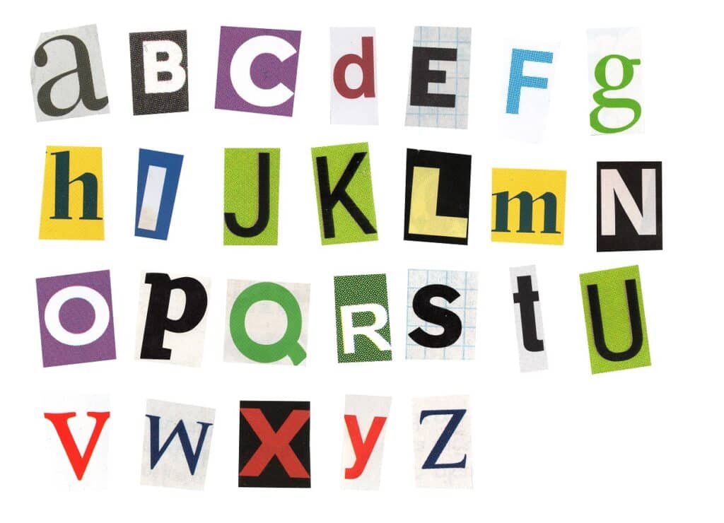
Typography plays a crucial role in the design, readability, and impact of your printed materials. Selecting the right font can be a daunting task, but understanding the basics of typography and following a few simple guidelines can make the process easier.
Choosing your typography effectively can not only elevate your design but also help you communicate your message more efficiently. In today’s blog, we’ll discuss essential tips for choosing the perfect font for your printed projects, ensuring they are visually appealing and leave a lasting impression on your readers.
Choosing the Right Font for Your Project
When selecting fonts for your project, consider their purpose, target audience, and medium. You want to ensure that the chosen font aligns with your brand identity, appeals to your audience, and is legible in various sizes. Also, opt for versatile fonts with multiple weights and styles, such as bold, italic, and light, to create contrast and hierarchy within your design.
Keep in mind the readability on different media, like print or digital. Additionally, avoid overly decorative or script fonts for body text, as they may decrease readability. By carefully considering these factors, you can make an informed decision on the perfect font for your project.
Font Pairing and Hierarchy
When combining fonts, aim for harmony and balance. Pair fonts with similar characteristics, such as a serif with another serif or a sans serif with another sans serif. Contrasting fonts, like a bold display font with a simple sans serif, can also create an appealing visual effect.
Establish a clear visual hierarchy using font size, weight, and style to guide the reader’s eye through your content. Limit the number of typefaces to two or three to avoid overwhelming the design. Use a consistent approach for headings, subheadings, and body text to create structure and coherence within your project.
Readability and Accessibility in Typography
Readability and accessibility are essential factors to consider when selecting fonts for your printed materials. Prioritize fonts that are easy to read, especially for those with visual impairments. Choose typefaces with distinguishable letterforms and avoid overly decorative or script fonts for body text, as they can hinder readability.
Consider factors such as font size, line spacing, and contrast when improving accessibility. Larger font sizes and adequate line spacing can enhance readability, while sufficient contrast between text and background colors ensures that your content remains legible.
Additionally, pay attention to the kerning and tracking of your chosen font, as proper spacing between letters can significantly impact readability. By focusing on these elements, you can create printed materials that cater to a wide range of readers, ensuring your message is effectively communicated.
Typography Licensing and Legal Considerations
Before using a font for your printed materials, ensure that you understand its licensing terms and usage rights. Many fonts are available for free or under open-source licenses, but some may require a commercial license for use in professional projects.
Exploring Font Resources
High-quality fonts can be found through reliable resources such as Google Fonts, Adobe Fonts, and Font Squirrel. Take advantage of these platforms to discover new typefaces and expand your design possibilities.
Careful font selection is essential to create visually appealing and effective printed materials. By understanding the basics of typography and keeping the purpose, audience, and medium in mind, you can elevate your designs and leave a lasting impression on your readers.
To learn more about typography and the commercial printing process, explore more posts on the Linemark blog today!


 Campaigns")