

 11/17/2026
 Steve Bearden
A quieter page can make a stronger book. A minimalist book interior layout for printing gives text room to breathe, creates a clear reading rhythm, and keeps decoration from competing with the content. The goal isn’t to strip away personality; it’s to make every design choice earn its place.
If you’re weighing a simple style against a more decorative one, the right balance depends on the book’s content and how readers will use it. Thoughtful templates create consistency, while considered typography, branded details, and well-placed photos add character without crowding the layout. This guide explains how to strike that balance, organize left and right pages, and handle visuals and tables so the finished interior feels cohesive and ready for print.
Key Takeaways
- Use a restrained visual system to keep attention on the content, then apply typography and decorative details consistently.
- Build reusable templates for left pages, right pages, and spreads so chapters and complex layouts feel cohesive.
- Give branded elements a clear role, from chapter markers and pull quotes to subtle details that guide readers through the book.
- Plan photo placement around the reading flow; grouping images can create a cleaner experience in a paperback interior.
Adding branded page details and marketing elements
Branded details work best when they support the reader’s experience rather than compete with the text. In a book interior layout for printing, use a small set of typefaces, colors, and recurring graphic cues. For example, a bold brand typeface can serve as the display face for chapter titles, while body text remains easy to read. A restrained, repeating visual system gives the book a consistent look without making every page feel identical.
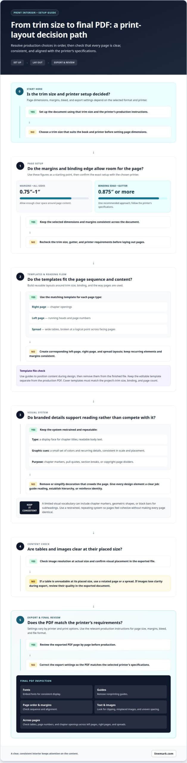
Choose the trim size before setting page dimensions or margins. Trade paperback trim sizes vary, so choose a size that suits the book and the printer’s specifications. Allow margins of 0.75″ to 1″ on all sides, and give the binding edge enough gutter space; a gutter of 0.875″ or more is one recommended approach. The exact page setup must align with the selected printer’s specifications.
Small details can carry a brand without crowding the page. Use stars as copyright-page dividers, or add a “thanks for reading” page with the author’s website and book hashtag. Keep decorative marks consistent in scale and placement. For an author using geometric shapes, repeating circles or squares in chapter markers can connect the interior to the wider visual identity.
For Amazon KDP, IngramSpark, and other printers, prepare an interior PDF that matches the chosen trim size and the printer’s file specifications. Accepted settings vary by printer and print options, so follow the relevant production instructions for page size, margins, and bleed. Bleed is the area where artwork extends beyond the trim edge, helping prevent unprinted slivers after cutting.
Use the right tool for each production task: Microsoft Word supports document layout and PDF export; BookBaby’s manual page setup instructions guide page-dimension setup; and a PDF viewer helps you inspect the exported file. Then follow this sequence:
- Set the trim size and page margins.
- Apply consistent display type and branded details.
- Export the interior as a PDF using the printer’s required settings.
- Review every page for clipped text, misplaced images, and uneven spacing.
A careful final review catches layout issues before production and keeps branded elements clear throughout the book.
Interior template layouts for right pages, left pages, and spreads
Build templates around the book’s trim size, binding, and page sequence. A right-page template can set chapter openings, while a left-page version handles running heads and page numbers. Keep margins and recurring elements consistent across both. For a wide table, use a spread and break the content at a logical point across facing pages.
An interior-template PDF may show its inner-page template on page 2. Use that page to understand the file’s guides and layout zones. Guides help position content during design, but remove them from the finished file. Keep the editable template version separate from the production PDF.
Cover templates depend on the book’s specifications, including trim size, binding, and page count. Download the matching cover and interior templates for the chosen format. A template from 48 Hour Books can serve as a layout starting point when its specifications match the project. Don’t assume a cover file fits another production setup.
Adobe InDesign offers detailed control over typography and page layouts. Microsoft Word can work for text-led books, while Affinity Publisher offers page-design tools. Vellum is geared toward book formatting. The best fit depends on the layout’s complexity, your workflow, and the required output format.
Before export, embed fonts so typefaces display consistently, and remove nonprinting guides. Review page order, margins, and image resolution at actual size. Check that tables, page numbers, and chapter openings align across left pages, right pages, and spreads. Reviewing the final PDF can reveal shifts that are easy to miss in an editable file.
For print-ready files, match the PDF to the selected printer’s specifications for trim size, bleed, and file format. These requirements vary by production setup, so the printer’s template should guide the final export. A custom book printing project can carry the approved layout into production.
What are the benefits of using a minimalist style for book layout design?
A minimalist style gives each element a clear job: guide reading, establish hierarchy, or reinforce the author’s identity. For example, a bold geometric circle can frame a pull quote or chapter number, while a plain text page keeps attention on the story. This approach suits fiction, poetry, and practical nonfiction when decoration might interrupt the text.
Use a small set of visual rules throughout the document. A sans-serif typeface can suit a casual book about social media, while restrained chapter markers help the design feel consistent. Black bars can distinguish subheadings without adding another decorative font. Readers can scan sections quickly, and key numbers or quotations remain easy to find.
Professional book interior layout costs in the United States depend on manuscript length, design complexity, image preparation, and revision needs. Pricing is provided after a quote request.
Common layout mistakes include inconsistent styles, crowded pages, tables that are too small, and images that lose clarity during export. A table that is unreadable at its placed size needs a different treatment, such as a rotated page or a spread. Check headings, page breaks, and image quality in the exported document, not just in the editable file.
Custom trim sizes can support a distinctive format, but they also affect page composition and production setup. A poetry collection may benefit from deliberate white space, while a reference paperback may need compact tables and clear navigation. The interior design should suit the manuscript’s purpose, not add decoration for its own sake.
Keep branding selective. A consistent yellow, black, and white palette with geometric shapes can create a recognizable system; use those elements for chapter numbers, pull quotes, or section breaks. Before export, review a sample fiction chapter and a text-heavy page to confirm both layouts remain readable.
Photo placement in paperback interiors
In a paperback, photo placement affects pacing, page count, and how clearly each image reads. For image-heavy manuscripts, grouping photos in a dedicated section can create a cleaner reading flow than placing them inline throughout the text. This also lets readers move between the main narrative and visual material without interrupting every chapter.
Plan each image around its purpose. A portrait may sit beside a short caption, while a sequence of process photos may work better across facing pages. Keep captions close to their images, and make sure nearby text explains what readers should notice. In Adobe InDesign, use image frames to position photos and align related elements consistently. Review the exported PDF at actual size to catch cropping, awkward gaps, or captions separated from their images.
Tables and diagrams need the same attention. If a table feels cramped across half a page, rotate it or give it a full page to improve legibility. Keep labels readable and break dense content at a logical point rather than shrinking every element to fit.
Spine width depends on the book’s page count and paper stock. Those specifications affect the cover file, so finalize interior pagination before preparing the full cover design. A change in page count can alter the spine area and shift the front and back cover panels.
Paperback cover bleed is the area where background color or artwork extends beyond the trim edge. It helps prevent unprinted slivers if cutting shifts slightly. Keep important text and design elements inside the safe area, away from trim and fold lines. Follow the printer’s cover template for the required bleed and layout.
Use a PDF viewer to inspect the finished file page by page, including photo crops, image resolution, and the spine alignment. Keep the manuscript PDF and cover PDF as separate production files. For a coordinated production workflow, prepare your book for printing with the final interior and cover specifications aligned.
Linemark: Custom Book Printing
Linemark provides Custom Book Printing for organizations preparing books for production. Once the interior layout, images, and cover design are ready, printing brings those approved files together as a physical publication.
Turn to Linemark when you’re planning a custom book project and need a commercial printing partner for production. Decisions about format, paper, binding, and print method shape how the finished book presents your content, so align those choices with its intended use and approved files. Linemark also provides Direct Mail and Large Format Graphics for related communications needs, while Commercial Printing supports other printed materials.
Contact Linemark to discuss your custom book printing project.
Move Your Book Toward Production
A strong interior is more than a polished file. It’s part of how your organization communicates its ideas, expertise, and point of view. Before production begins, consider how the finished book will serve its purpose, whether it introduces a subject, helps readers use information, or represents an organization in a lasting format. Those priorities can guide decisions about the final design and production approach.
A considered book interior layout for printing connects the reading experience with the book’s role beyond the page. Keep that purpose central as your project moves from approved files to production. Linemark can support the next stage with Custom Book Printing, as well as Direct Mail and Large Format Graphics for related communications projects.
Bring your project goals and production plans together with a clear next step. Contact Linemark about your project, and move forward with confidence in the work you’ve prepared.
Frequently Asked Questions
What margin depth avoids clipping text on standard trade paperback novels?
Use margins of 0.75″ to 1″ on all sides as a practical starting point for a standard trade paperback. The binding edge needs room for the page to curve inward, so assess the gutter separately from the outer margin. For a text-heavy novel, inspect a printed proof near the spine to make sure lines remain comfortable to read.
Why must I remove template guidelines before exporting my final PDF?
Template guidelines are design aids, not part of the finished page. If visible guides remain in the artwork or document layer, they may appear in the exported PDF and print as unwanted lines. Before export, hide or delete guide layers, then review the PDF at page size. Pay particular attention to trim marks, alignment lines, and sample text included in the template.
What is book interior layout and what elements does it include?
Book interior layout is the arrangement of content across a book’s pages. It organizes text, chapter starts, page numbers, headings, tables, and visual material into a readable sequence. For example, a cookbook might combine recipe text with ingredient lists and photographs, while a novel may rely mostly on paragraphs, chapter titles, and page numbers.
How do you set margins, gutters, and bleed for a printed book?
Set the page dimensions to the selected trim size, then define margins around the live text area. Allow extra space on the binding side for the gutter, since pages curve toward the spine. Extend any background color or artwork that reaches a trimmed edge into the bleed area. Use the printer’s production specifications to determine the exact document setup.
Which file formats and fonts are best for print-ready book interiors?
A print-ready PDF is the production file most printers use for the interior. Keep an editable source document, such as an InDesign file, for revisions, but export a separate PDF for output. Embed fonts during export so the intended typefaces remain consistent when the file opens on another system. Review the PDF for substituted fonts before delivery.
How do you format page numbers, headers, chapter openings, and front matter?
Apply page numbers and running headers through consistent master-page or parent-page settings, then suppress them where they distract, such as on chapter title pages. Treat front matter as a distinct sequence from the main text, with a clear title page, copyright page, and contents page when needed. Check an opening spread and a typical body spread for alignment and hierarchy.