


 11/12/2026
 Steve Bearden
A strong book cover makes its appeal clear in about one second. The most effective book cover design principles bring genre, tone, imagery, color, and typography together so readers can quickly recognize what kind of story awaits and read the title at a glance.
A striking image or bold color can draw attention, but it should support the book’s conventions rather than distract from them. This guide explains how to assess an effective cover, use genre cues and color with purpose, compare covers for useful patterns, and organize the title, author name, and supporting text into a clear hierarchy. Use this practical framework to shape a cover that reads well, feels cohesive, and gives every element a defined role.
Key Takeaways
- Build a visual brief around the book’s genre, tone, setting, and intended audience before choosing imagery.
- Use familiar genre cues and a controlled color palette to help readers recognize the book’s mood without crowding the design.
- Give the title the clearest visual priority, then size and place the author name and supporting text to preserve readability.
- Compare covers in the same genre to spot useful patterns, then adapt them to create a distinct, cohesive design.
1. What makes a good book cover?
A useful visual brief starts with the book’s genre, tone, setting, central character, and intended readers. State the feeling the front cover should create, then identify one image or symbol that supports the story. A cover should communicate its basic appeal in about one second, so prioritize the clearest idea. A strong picture is one of three possible layout approaches; typography-led and simpler designs are other options. Sketch concepts first, exploring different compositions before developing the strongest direction digitally. Some designers sketch hundreds of ideas, but the goal is a coherent visual, not a high sketch count.
Print and ebook covers serve different formats. An ebook typically needs a front-cover image that remains clear as a small thumbnail, while a print edition needs a complete layout for the front, spine, and back that follows production specifications. Keep the focal image and title prominent on the front. Use negative space to separate them and guide the eye to the title.
There is no single standard print-cover dimension for every book. Trim size depends on the chosen format, while the full cover layout also depends on page count, paper, and binding, which affect spine width. Set the trim size and production specifications before finalizing artwork so important text stays clear of folds and edges.
Organize required information by panel: place the title and author on the front, the title and author on the spine, and the description or blurb on a paperback’s back. The back can also carry practical details such as the barcode, ISBN, and pricing information. For hardcovers, praise traditionally appears on the back, while the description may go inside the jacket.
Common mistakes include competing focal points, crowded text, weak contrast, and imagery that misrepresents the genre. Test readability at thumbnail size and in grayscale; clear contrast and legible type help readers distinguish key elements. Don’t rely on color alone to communicate essential meaning, and keep supporting text readable against its background.
2. Design conventions, contrast, and color psychology
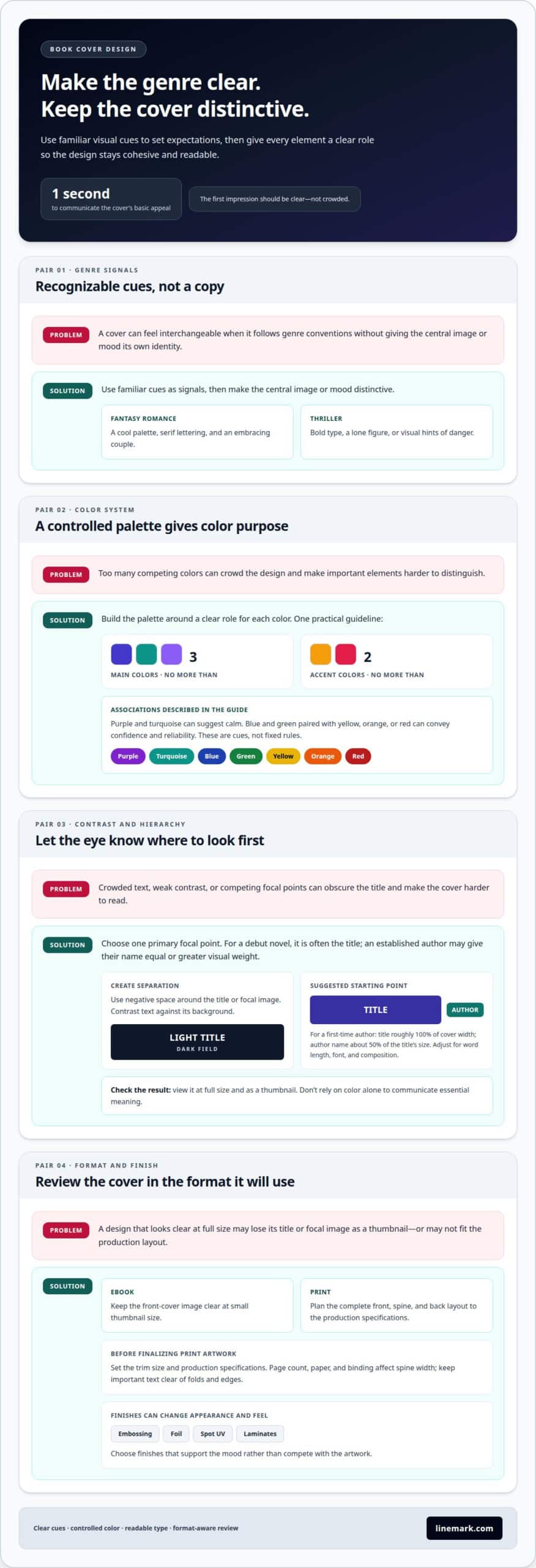
Genre conventions help readers recognize a book’s category before they read its description. A fantasy romance cover might pair a cool palette, serif lettering, and an embracing couple; a thriller may use bold type, a lone figure, or visual hints of danger. Treat these patterns as signals, not templates. Keep the central image or mood distinctive so the design fits its category without looking interchangeable.
Build the palette around a clear role for each color. One practical guideline is to use no more than three main colors and no more than two accent colors. Purple and turquoise can suggest calm, while blue and green paired with yellow, orange, or red can convey confidence and reliability. These associations are design cues, not fixed rules. Match colors to the story’s mood and make sure they distinguish important elements.
Composition matters as much as hue. Leave negative space around the title or focal image, then use contrast to separate text from its background. A light title against a dark field, for example, can remain legible at thumbnail size. Typography, color, imagery, and visual hierarchy work together: clear contrast improves readability, while a strong focal point tells the eye where to look first. Don’t use color alone to distinguish essential information.
Color can also shape the physical experience. Embossing, foil, spot UV, and different laminates can change a cover’s appearance and feel, so select finishes that support its mood rather than compete with the artwork. Review the design in its intended print context and adjust colors when the printed result doesn’t match the intended visual balance. Carrying cover artwork into a launch display can extend the same palette through large format graphics.
Before settling the composition, view it at full size and as a small thumbnail. Check that the title remains distinct, the image still communicates the genre, and decorative effects don’t obscure text. A restrained palette, deliberate spacing, and legible type give every visual element a clear purpose.
3. Establishing title and author-name hierarchy
Choose one primary focal point before setting the remaining type. For a debut novel, that’s often the title, while an established author may give their name equal or greater visual weight. The title, author name, and illustration should form a clear sequence, not compete for attention. Test the layout at thumbnail size to see whether readers notice the intended element first.
For a first-time author, one suggested starting point sets the title at roughly 100% of the cover’s width. Set the author name at about 50% of the title’s size, then adjust for word length, font, and composition. These are starting points, not fixed measurements. A long title may need multiple lines, while a short title can use more open space.
Carry the hierarchy onto the spine. Make the title the most prominent text, then include the author’s name at a smaller size that remains easy to read. Consistent type choices and placement help connect volumes in a series. A distinctive illustration or lettering treatment can still give each book its own identity.
Typography shapes legibility and tone. The U.S. Bureau of Labor Statistics notes that graphic designers select type, font, size, color, and line length for headlines, headings, and text. Apply the same considerations to a cover: compare serif and sans-serif options, check line breaks, and make sure letterforms stay distinct at reduced size.
Use a clear approval process with the author: share a layout, gather feedback on title prominence and tone, then revise before production. Ask focused questions, such as whether the title reads clearly and whether the type suits the intended audience. Consolidate comments into specific changes instead of layering conflicting edits. In the final review, check the front, spine, and back together, ensuring the author name is consistent and every text element remains readable.
4. Researching and comparing existing book covers
Start with a focused comparison set: choose covers in your genre, then record what they signal. For each example, note the image, typography, palette, title placement, and mood. Thriller covers often use bold typography, a lone figure, or cues of danger. Compare those choices with your manuscript and target audience. Keep the genre signals that fit, then identify a distinctive detail that can make your design recognizable.
Separate observation from imitation. Ask what each element helps readers understand, such as whether a shadow suggests suspense or a bright illustration signals a lighter tone. Some designers spend the first couple of days researching a project, and one inspiration board included 339 cover ideas. Use references to identify patterns and gaps, not to reproduce another book’s composition or artwork.
Compare DIY, premade, and custom cover design by weighing control, flexibility, and fit. DIY gives authors direct control over choices, while a premade cover starts with an existing design that can be adapted. Custom design develops a visual direction around a specific manuscript. Decide which approach suits your needs by considering how much tailoring the concept requires and whether its title, imagery, and genre cues align with the book.
Genre and audience should guide the comparison. A thriller aimed at adults may use tension and stark imagery, while a children’s adventure may need clearer character-focused illustration and a more playful mood. These are starting points, not formulas. Compare books reaching the same audience, then assess whether their visual choices communicate tone without revealing too much of the plot.
Before approving a direction, view it beside relevant covers and at thumbnail size. Record what stands out, what feels expected, and which detail gives the concept its own identity. Trying alternate layouts can clarify the strongest choice. Ready to move from a selected design to a printed edition? Prepare your cover for print.
Linemark: Custom Book Printing
Linemark provides Custom Book Printing for authors and organizations ready to turn a selected cover design into a finished book. Once the visual direction is settled, the cover needs to work as part of the complete printed piece, alongside the interior and chosen format. Aligning those elements helps carry the design consistently from front cover through spine and back.
Turn to Linemark when your cover is ready for print and you need a partner for book production. Share the approved design and project details so the printing plan can suit the book you’re creating. Custom Book Printing makes Linemark a natural next step after comparing concepts and setting your visual direction.
Contact Linemark to discuss your book printing project.
Carry your cover concept into the next stage
A finished cover can do more than identify a book. It can establish a recognizable visual thread across readers’ first encounters with the title, from the printed edition to launch materials. Apply book cover design principles with that broader purpose in mind: keep the central idea clear wherever the book appears, while adapting each format to its role.
As you prepare for publication, connect the design decision to the practical work ahead. Linemark offers Custom Book Printing, Direct Mail, and Large Format Graphics to support book production and related communications. If your cover direction is ready to move forward, contact Linemark about your book cover. A considered design gives your story a confident starting point, and the next step can bring that vision closer to readers.
Frequently Asked Questions
What makes a good book cover?
A good cover helps the intended reader recognize the book’s appeal and feel curious enough to learn more. It also stays coherent across its parts: for example, a symbol on the front can reappear subtly on the spine without competing with the title. Judge the finished design by whether its visual choices fit the story and no detail misleads readers about the book’s content.
What are the core principles of effective book cover design?
The core principles are clarity, genre fit, legibility, and a deliberate focal point. Effective book cover design principles also account for how elements work together, rather than treating color, type, and imagery as separate decisions. For example, if a dramatic photograph already sets the mood, restrained lettering can keep the title readable. Each design choice should serve the book’s message or help readers navigate the cover.
What are the steps for briefing a designer and reviewing book cover concepts?
Begin the brief with a concise description of the book, its intended audience, and the impression you want the cover to create. Include the title, required copy, format, and reference covers, with notes on what works or doesn’t. When concepts arrive, review each against those goals, give specific feedback, and consolidate revisions. For instance, request a clearer title treatment rather than simply saying the layout feels wrong.
How can authors test whether a book cover appeals to readers and works as a thumbnail?
Show a reduced version to readers who match the book’s intended audience, without first explaining the plot. Ask what genre they expect, what they notice first, and whether they can read the title. Compare their responses with the cover’s goal. If readers consistently misread the genre or overlook the title, adjust the visual emphasis, then repeat the review with the revised thumbnail.